I Completed My Biggest Site Redesign in Years. During Breakfast.
I rebuilt my entire website in 3 days using AI—not as a coding assistant, but as my actual developer. I made the decisions; Claude Code wrote 28,000 lines.
It's 8:47 AM on a Saturday. I'm eating vietnamese pork baguette (Banh Mi Heo Quay). And I've just deployed the final piece of the most comprehensive redesign my personal site has seen since 2021.
Five years. That's how long it had been since I'd done anything substantial to my website. Sure, I'd tweaked some copy here, added a blog post there. But the design? The architecture? The overall experience? Untouched since before the pandemic truly ended.
This morning, I finished the TRANSMISSION design system—a complete visual overhaul with new typography, color palette, animations, and a premium products page. But that's just the finale of a 3-day sprint that transformed everything.
The numbers:
- 40 commits in 3 days
- 28,129 lines of code added
- 4,950 lines of new CSS
- 11 CSS files (up from 1)
- Complete dark mode system
- Mobile-first responsive everything
- Custom products page with real screenshots
Total time for the entire redesign: a few hours over 3 days**.** 36 commits on Day 1 alone. Today's final push: 30 minutes while eating breakfast.
No design agency. No Figma mockups. No multi-month timeline. Just me and Claude Code. :D
Here's the thing I need to be clear about: I didn't write a single line of CSS. I didn't write the PHP. I didn't run the deployment commands manually. Claude Code did 100% of the implementation—the design, the code, the git commits, the deployment. I just made decisions. "More glow." "That font feels wrong." "Make the cards premium."
This is what AI-assisted development actually looks like in 2026.
---
The Starting Point: Abandoned Since 2021
Let me be honest about where I was.
My site in January 1st, 2026:
- One CSS file with 700 lines of spaghetti
- Poppins font for everything (the "I didn't really think about typography" choice)
- No design system — colors hardcoded everywhere
- Basic dark mode that broke on half the pages
- Products page: No product page, the entire site is just the blog.
- Mobile experience that was "responsive" in the same way a cheap suit "fits"
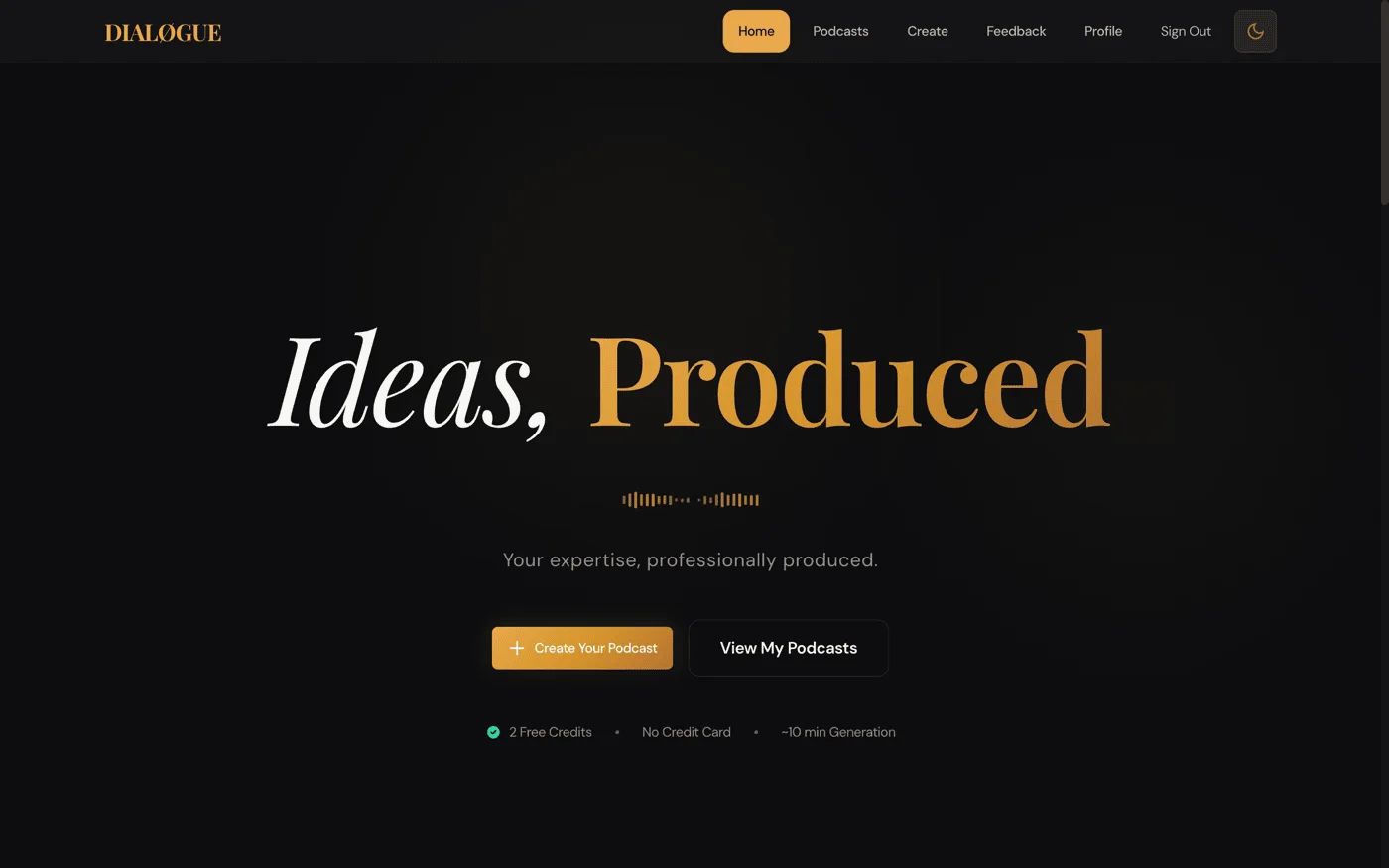
I'd been so focused on my main job, learning about Generative AI, and then building STRAŦUM and DIALØGUE—my two AI applications—that my personal site had become the cobbler's barefoot children.
Every time a potential client or collaborator visited, they saw a site that screamed "2021 called, they want their WordPress theme back."
---
Why Now? And Why This Way?
Two things happened in late 2025:
First, I shipped STRAŦUM and DIALØGUE. Two production AI applications, built solo while keeping my day job as VP of a global advertising agency. Real users, real revenue discussions, real credibility at stake.
My personal site was now the front door to actual products. It needed to match.
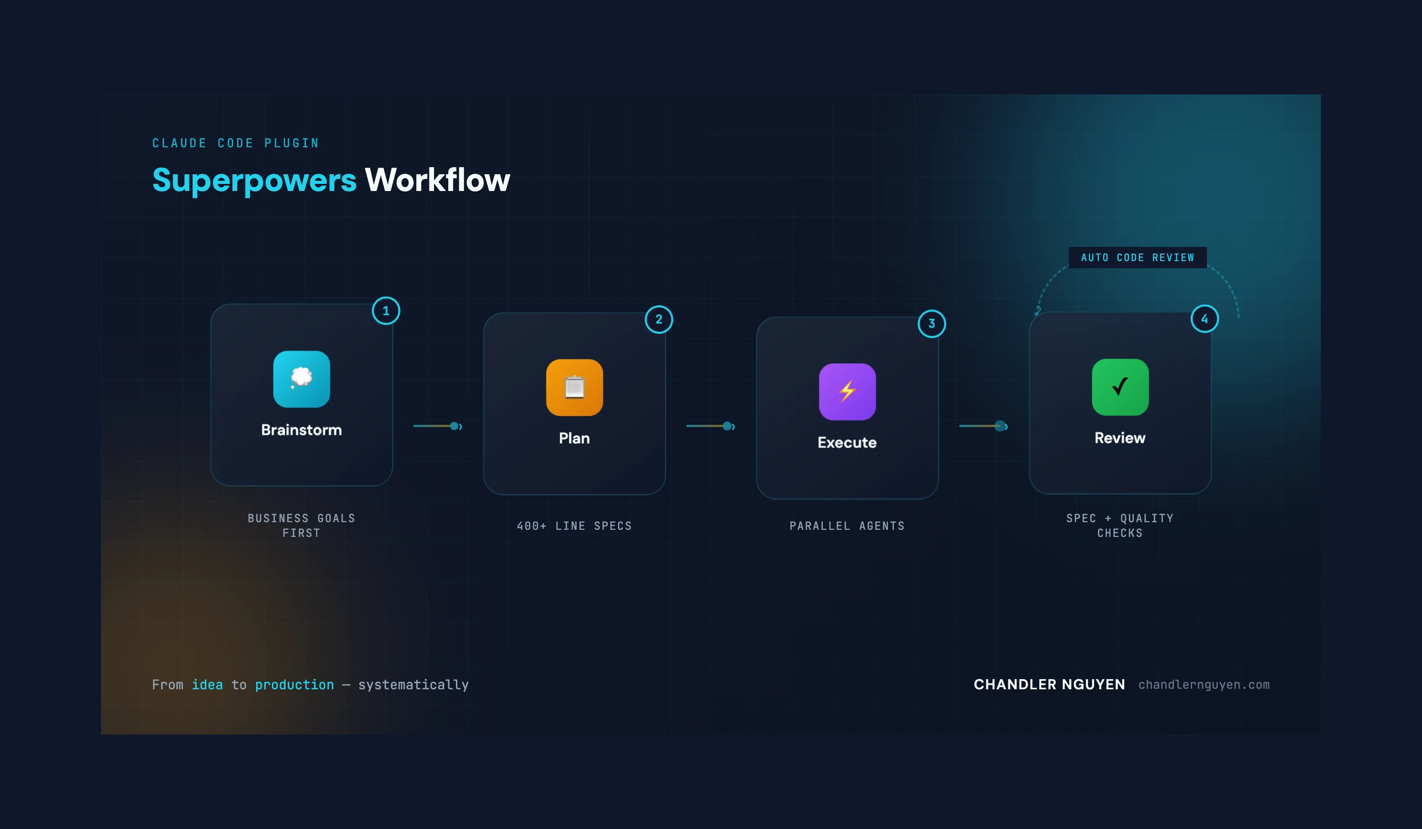
Second, I started using Claude Code seriously. Not as a chatbot. As a development environment. And I discovered something that changed everything: the `frontend-design` plugin.
This plugin doesn't just write CSS. It *thinks* about design. Typography pairings. Color theory. Spatial composition. It's what stops AI-generated code from looking like "AI slop."
I thought: what if I just... rebuilt everything? Not in a weekend hack. But properly. With a real design system. With Claude Code doing the heavy lifting while I make decisions.
---
The 3-Day Sprint: What Actually Happened
Day 1 : The Big Bang — 36 Commits
I didn't plan to do 36 commits in one day. But once I started, I couldn't stop.
Initial setup, backed up existing theme, started the CSS modularization.
Rebuilt the entire CSS architecture. That single 700-line file became:
```
css/
├── style.css          # Design tokens only
├── components.css     # Buttons, cards, navigation
├── homepage.css       # Hero, products, posts sections
├── about.css          # About page specific
├── blog.css           # Blog archive
├── dark-mode.css      # Complete dark mode system
├── mobile-nav.css     # Bottom navigation bar
├── search.css         # Search overlay
├── single-post.css    # Blog post typography
└── products.css       # Premium products page
```
Each file has one job. Each file uses CSS variables from the root. No more hunting through 700 lines to find why a button is the wrong color. :P
Dark mode overhaul. My old dark mode was embarrassing—text that disappeared, buttons with no contrast. I rebuilt it from scratch:
- 658 lines of dedicated dark mode CSS
- Proper contrast ratios (WCAG compliant)
- Removed all 89 `!important` declarations (yes, 89)
- Semantic color tokens that swap automatically
By the end of the day: Homepage redesigned, About page rebuilt, mobile bottom nav added, newsletter integration done. 36 commits.
Day 2: Architecture & Infrastructure — 9 Commits
Day 2 was about making everything maintainable.
The big refactor: `functions.php` went from 724 lines of chaos to 25 lines of clean includes:
```php
require_once get_stylesheet_directory() . '/inc/enqueue.php';
require_once get_stylesheet_directory() . '/inc/homepage-sections.php';
require_once get_stylesheet_directory() . '/inc/navigation.php';
require_once get_stylesheet_directory() . '/inc/search.php';
require_once get_stylesheet_directory() . '/inc/blog.php';
```
Also set up Docker for local development, did a GCP security audit, and wrote documentation.
Day 3: The TRANSMISSION Finale — The Breakfast Sprint
This is where the `frontend-design` plugin earned its keep.
I described what I wanted: "Retro-futuristic. Analog past meets digital future. Premium but not corporate. Technical but warm." Then I went to get breakfast.
When I came back with my bánh mì, Claude Code had generated the complete TRANSMISSION design system:
Typography:
- Playfair Display — Headlines (elegant, editorial)
- DM Sans — Body text (clean, readable)
- JetBrains Mono — Code and data (technical credibility)
Colors:
```css
--color-cream: #fffbeb;    /* Warm background */
--color-navy: #0f172a;     /* Deep primary */
--color-cyan: #22d3ee;     /* Energy accent */
--color-amber: #f59e0b;    /* Warm accent */
```
Fluid Typography:
```css
--text-5xl: clamp(3rem, 2rem + 5vw, 5rem);
```
Headlines automatically scale from mobile to desktop. No media queries needed.
Then I tackled the products page. The page that was just text became:
Hero Section:
- Terminal-style eyebrow text
- Playfair headline: "What I'm Building"
- Stats bar: 2 Live Platforms | 99.7% Performance Gain | 92% Cost Reduction
- Floating geometric shapes with subtle animations
Product Cards:
- Premium navy gradient backgrounds
- Real screenshots from production sites (not mockups)
- Browser-frame containers with window control dots
- Hover states with cyan/amber glows
- Feature lists with arrow markers
- Full-width CTAs
The screenshots alone were a journey. Claude Code navigated to my production sites, captured the pages, optimized them from 1.8MB to 229KB (86% smaller), and wrapped them in styled containers.
---
The Stack: Surprisingly Simple
Here's everything I used:
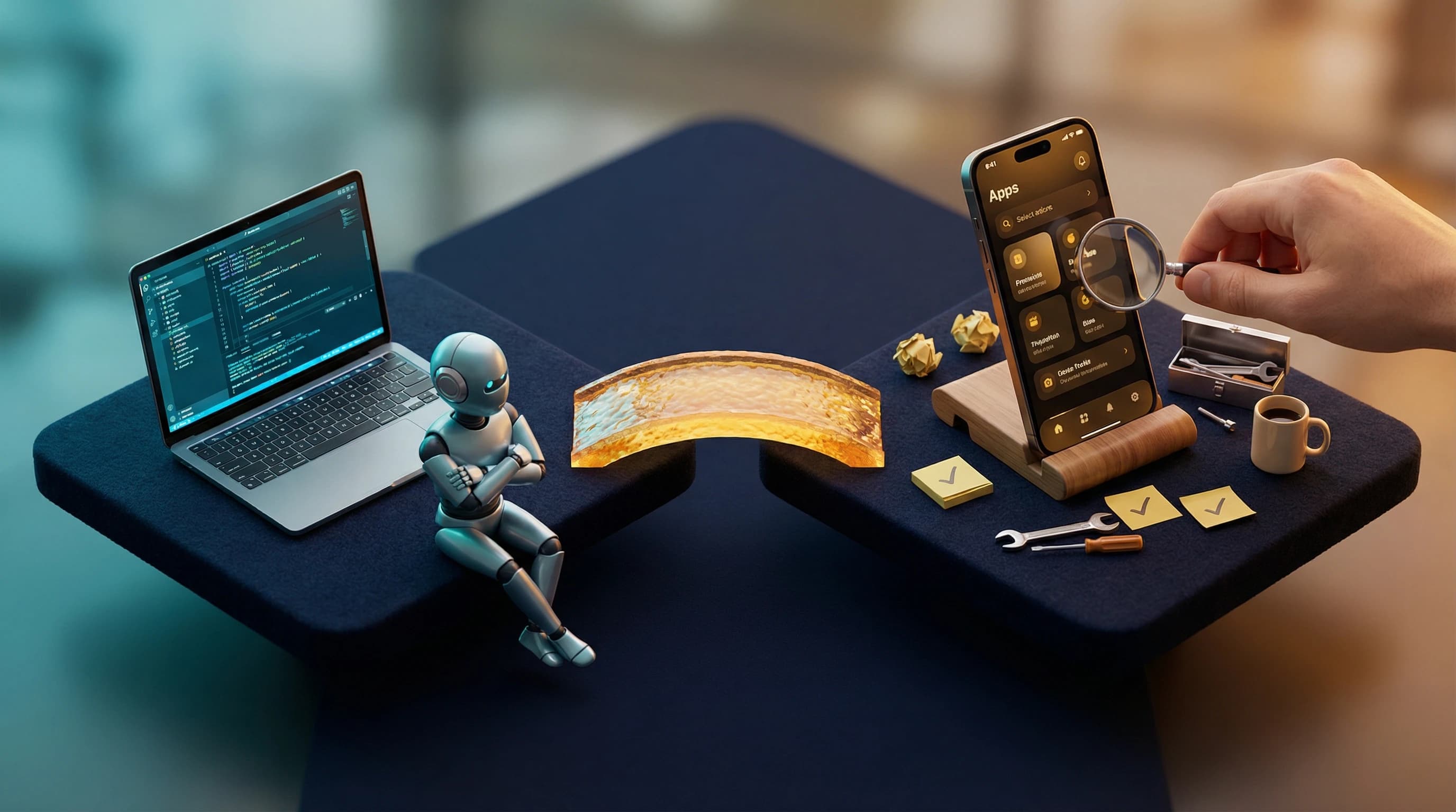
Claude Code — The AI that writes code, runs commands, and maintains context. This is an AI that has access to my filesystem, can run git commands, and remembers what we built yesterday.
frontend-design plugin — The difference between "AI-generated CSS" and "CSS that looks designed." Typography theory, color relationships, spatial composition built in.
Docker — Local WordPress development. One `docker-compose up` and I have a production mirror.
Chrome DevTools MCP — Claude Code can control a browser. "Check mobile dark mode" → actual screenshot of the rendered page. No tab-switching.
gcloud CLI: which Claude controls
---
The Honest Parts
This wasn't magic. Things went wrong:
Nested folder chaos: Docker copy created a `gambit-child/gambit-child/` structure. Took 10 minutes to debug.
Dark mode text disappearing: Some headings were inheriting wrong colors. Fixed by being more specific with selectors.
Image optimization: Raw screenshots were huge. Had to learn that `sips -Z 800` on macOS resizes images without external tools.
WordPress template assignment: Forgot the new products page needed to be assigned in WP admin. Classic.
The difference is that debugging took minutes, not hours. Claude Code could see the rendered page, identify the issue, and propose fixes in the same conversation.
---
Before & After: The Numbers
| Metric | January 1, 2026 | January 10, 2026 |
|--------|-----------------|------------------|
| CSS Files | 1 | 11 |
| Lines of CSS | ~700 | 4,950 |
| PHP Architecture | Monolithic | Modular (6 files) |
| Typography | 1 font | 3-font system |
| Color Tokens | ~5 hardcoded | 15+ semantic |
| Dark Mode | Broken | 658 lines, WCAG compliant |
| Products Page | Plain text | Premium with screenshots |
| Mobile Nav | None | Bottom bar with 6 actions |
| Animations | 0 | 7 (fadeInUp, float, glow, etc.) |
| Last Major Update | 2021 | Today |
Total transformation: 28,129 lines added across 123 files in 40 commits over 3 days. All written by Claude Code.
---
What This Cost
Money: $0 for design. Claude Code subscription. GCP hosting I already had.
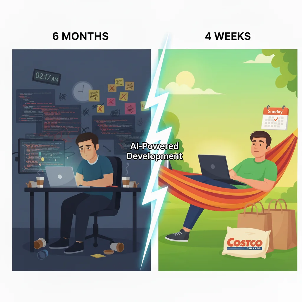
Time: 3 days elapsed. But my actual active time? Maybe 2-3 hours total. I'd describe what I wanted, Claude Code would build it, and I'd check back later to review. This morning I kicked off the final redesign, went for breakfast, and came back to confirm—30 minutes of actual attention.
My actual contribution: Zero lines of code. I described what I wanted, reviewed what Claude Code built, and said things like "the hover state needs more glow" or "that spacing feels off."
Comparison: A design agency would have quoted 8-12 weeks and $10,000+ for this scope. And I'd still have to implement their Figma files myself.
---
What I Learned
1. I'm not a developer anymore—I'm a creative director. Claude Code wrote every line of code. I made taste decisions. "That animation is too slow." "The cyan needs more glow in dark mode." "Make the hero stats more prominent." This is a fundamentally different skill than coding.
2. Modularize first. Claude Code's first instinct was to split the codebase into logical files before making visual changes. Every subsequent change was easier because of this foundation.
3. Design systems compound. Once TRANSMISSION tokens existed, every new component was just combining existing variables. The products page took 45 minutes because the system was already there.
4. The frontend-design plugin is the difference. Regular AI-generated CSS looks like "AI slop"—generic, safe, forgettable. The frontend-design plugin thinks about typography pairings, color theory, spatial composition. It's why this doesn't look AI-generated.
5. Ship incrementally. 40 commits, not 1. Each piece went live as it was ready. Claude Code handled the git workflow—staging, committing, pushing, creating PRs.
---
Try This Yourself
If your personal site has been "good enough" since 2021:
1. Install Claude Code with the `frontend-design` plugin
2. Describe the vibe you want (mine: "retro-futuristic, analog meets digital")
3. Start with architecture — modularize before beautifying
4. Build the design system — tokens, typography, colors
5. Then build pages — each one uses the system you created
6. Deploy often — don't wait for "done"
The hardest part isn't the technology. It's deciding what you want your site to *feel* like.
Once you know that, the rest is conversation.
Update: That lesson about taste over implementation became even clearer when I started building a native iOS app without knowing Swift. Claude scaffolded 7,568 lines of code in one evening — but the "creative director" work of making it feel right? That's still entirely human.
When's the last time you rebuilt something you'd been putting off for years? What finally pushed you to start — and how did it feel when it was done?
Cheers,
Chandler
---
*Still building, still shipping, still enjoying that bánh mì.*
---