The US has been suffering from “Deaths of despair” over many years. Tragic. The term refers to deaths by drug overdose, alcoholic liver disease, and suicide. It was coined by Anne Case and Angus Deaton in 2015. In Mar 2020, they published another deeply insightful article “epidemic of despair” on Foreign Affairs. The narrative was intuitive, supported by data points. It reinforces what I have heard from Ray Dalio, Thomas Friedman, Joe Rogan, John Oliver. However, I had a nagging feeling that some data points were missing, and I didn’t see the full picture. For example:
- “Life expectancy at birth for Americans declined for three consecutive years, from 2015 through 2017“.
- My question: Since the authors didn’t include the actual decline, it made me wonder whether the claim was true? How significant was the decline?
- “Now, the United States may be leading Western nations in the opposite direction. Might American deaths of despair spread to other developed countries? On the one hand, perhaps not. Parsing the data shows just how uniquely bleak the situation is in the United States.“
- My question: Did we not see the same trend in other G7 countries?
- “A major reason for the decline in life expectancy is increasing mortality in midlife, between the ages of 25 and 64, when the most rapidly rising causes of death are accidental poisoning (nearly always from a drug overdose), alcoholic liver disease, and suicide. Overdoses are the most prevalent of the three types of deaths of despair, killing 70,000 Americans in 2017 and more than 700,000 since 2000.“
- My question: Is it true that increasing mortality in midlife was the main reason behind the decline in life expectancy?
- While the authors highlighted to us the number of death by overdose, alcoholic liver disease, and suicide, what were the leading causes of death in the US 2015 – 2017?
- In percentage, was the “death of despair” the number 1 cause of death?
From what I initially found, I almost made the wrong conclusion that the authors didn’t present the whole truth. Luckily, after checking the authors’ credentials, it forced me to dig deeper. What I subsequently uncovered changed my initial reaction. My main sources of data are the US Census Bureau, the National Center for Health Statistics (NCHS under the CDC), and the World Bank. I need to use the World Bank data so that I can compare data between countries easily.
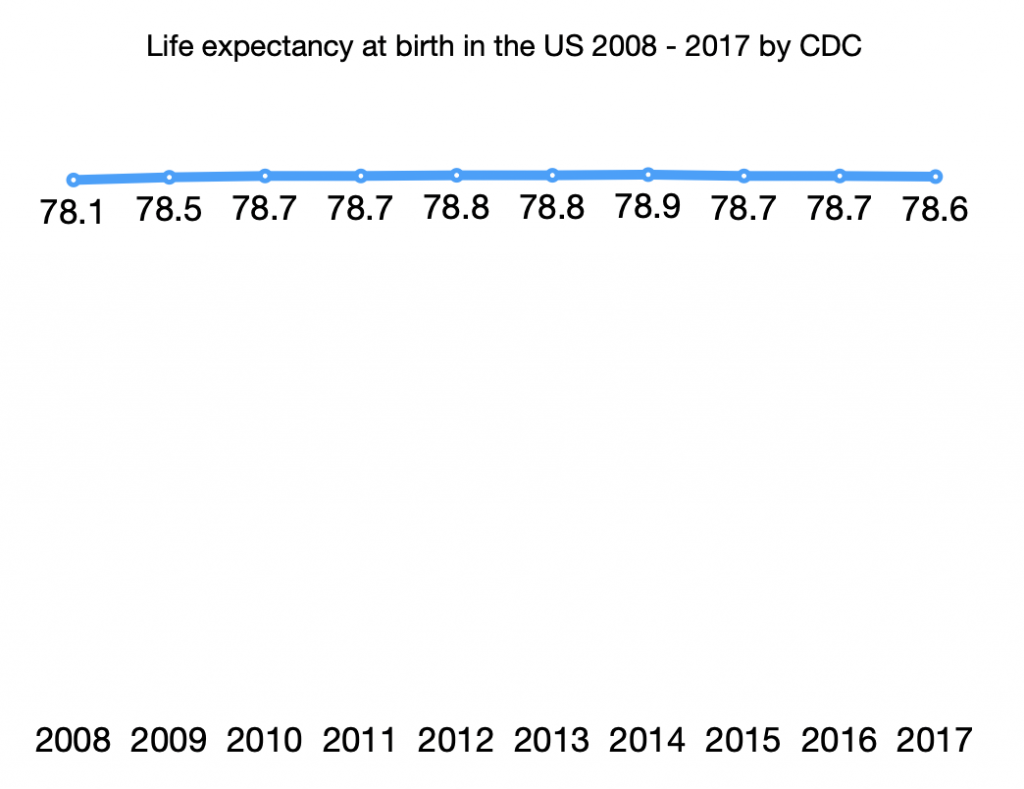
1. There was a drop (about 2 months) in life expectancy at birth in the US since 2015 to 2017/2018
Using the data from NCHS, the graph below shows the US life expectancy at birth between 2008 – 2017. The drop between 2014 – 2017 was about two months. To put this decline in perspective, according to the report “Living Longer: Historical and Projected Life Expectancy in the United States, 1960 to 2060“, life expectancy is expected to increase by about 7 years between 2017 and 2060. This translates to an average gain of 0.16/year (2 months/year). Hence, this drop was significant.
The statement “life expectancy at birth for Americans declined for three consecutive years, from 2015 through 2017” is accurate.
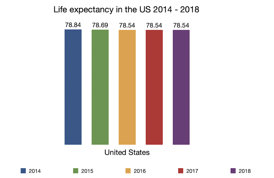
2. Life expectancy trend in many G7 countries was quite similar to the US from 2014 to 2018
The next question I want to understand is whether the decline in life expectancy from 2014 – 2018 was unique to the US.
Caveat: the Work Bank data on life expectancy in the US differs from the NCHS data. However, the trend was the same i.e. a big drop between 2014 – 2015 and then a flat line between 2016 – 2017.
The World Bank is using data from the following sources: ( 1 ) United Nations Population Division. World Population Prospects: 2019 Revision, or derived from male and female life expectancy at birth from sources such as ( 2 ) Census reports and other statistical publications from national statistical offices, ( 3 ) Eurostat: Demographic Statistics, ( 4 ) United Nations Statistical Division. Population and Vital Statistics Report ( various years ), ( 5 ) U.S. Census Bureau: International Database, and ( 6 ) Secretariat of the Pacific Community: Statistics and Demography Programme.
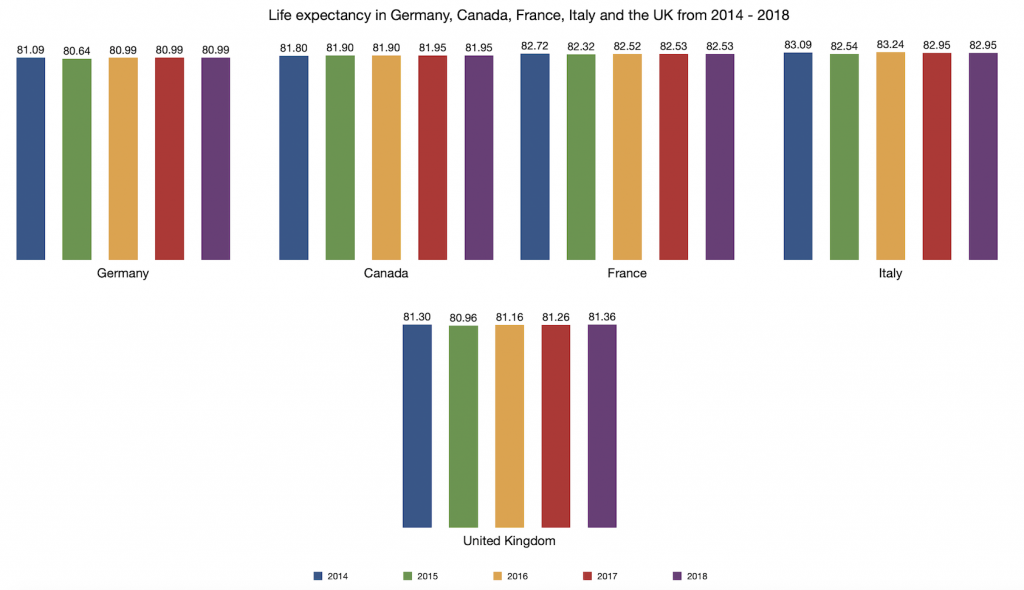
Germany, Canada, France, the UK, and Italy had similar trends. You can see them in the graph below. (click on the image if you want to see it in a bigger size)
So my conclusion for this question is that the overall life expectancy trend was Not unique to the US between 2014 – 2018.
3. “Deaths of despair” would be among the top 10 leading causes of death in the US if it was a separate category
Taking data from NCHS (CDC), below are the leading causes of death in the US 2016 and 2017.
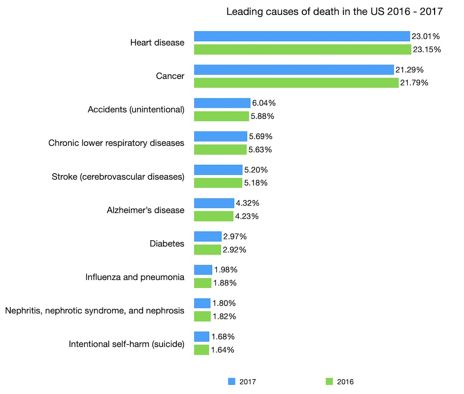
When you look at the above table, your first reaction may be “what is going on”? Deaths of despair were supposed to be a serious problem in the US. Why is it that we only see suicide amongst the top 10 causes and its percentage was so small. The top 10 leading causes contributed about 74% of all deaths in 2017 so if alcoholic liver disease or drug overdose were not in the top 10, their percentages might be very small? The deaths by diabetes and influenza were a lot more than suicide, we should actually focus on those.
My initial reaction was exactly that. This insight, together with the trends from other G7 countries, made me start to doubt the overall narrative of the article. I looked up the author’s credentials again. Perhaps I missed something? I should dig deeper. Well, as it turned out, under the category “accident (unintentional injuries), we have the subcategory “unintentional poisoning deaths” (almost always drug overdose). In 2017, the number of unintentional poisoning deaths was 64,795. Under the suicide category, we have “Poisoning suicides” and there were 6,554 deaths in 2017. Based on these data points, it makes sense that the CDC reported more than 70,000 drug overdose deaths in 2017.
It is then reasonable to estimate that deaths from drug overdose, suicide alone exceeded 100,000 in 2017. Also, the number of alcoholic liver disease deaths was 22,246. If we had “Death of despair” as a category, it would be amongst the top 10 causes of death in the US, rank above diabetes and influenza.
4. Did mortality in midlife (between the ages of 25 and 64) increase in the US between 2015 – 2018?
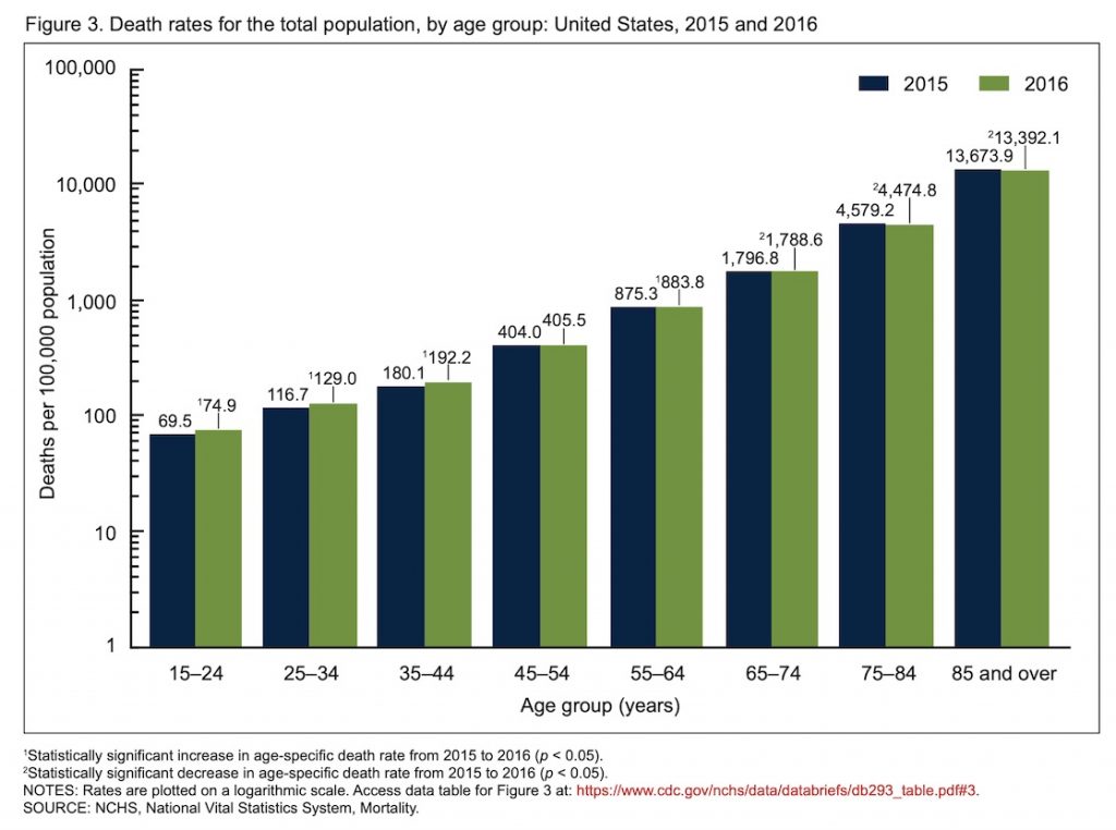
When we look at the mortality rate by age group between 2015 – 2016, 2016 – 2017, 2017 – 2018 (latest available data), we see a mixed picture.
From NCHS, “Death rates increased significantly between 2015 and 2016 for age groups 15–24 (7.8%), 25–34 (10.5%), 35–44 (6.7%), and 55–64 (1.0%).” The change was not statistically significant between the 45-54 age group. When you sum up the death rates across different age groups to get the age group 25-64 rate, we can see an increase between 2015 to 2016 (1576.1 to 1610.5 or 2.2%).
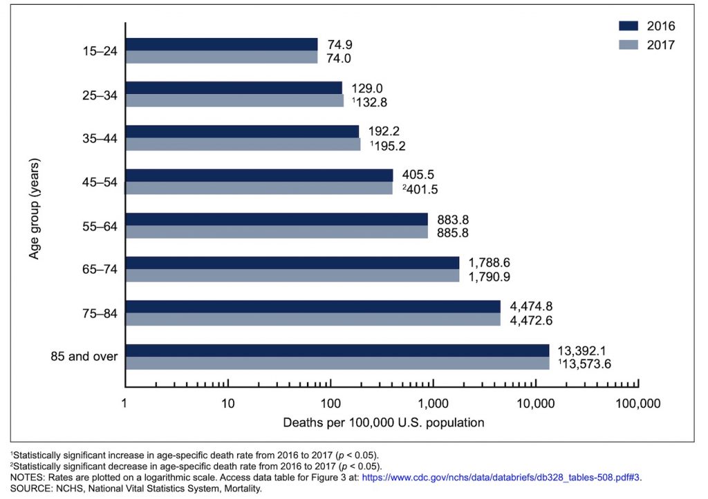
Using similar data from NCHS, “death rates increased significantly between 2016 and 2017 for age groups 25–34 (2.9%), 35–44 (1.6%), and 85 and over (1.4%).
The death rate decreased significantly for the age group 45–54 (1.0%).” The change within the age group 55-64 was not statistically significant. So all together, between 2016 to 2017, we can say that there has been an increase in mortality rate between the ages of 25 to 54, not 25 – 64
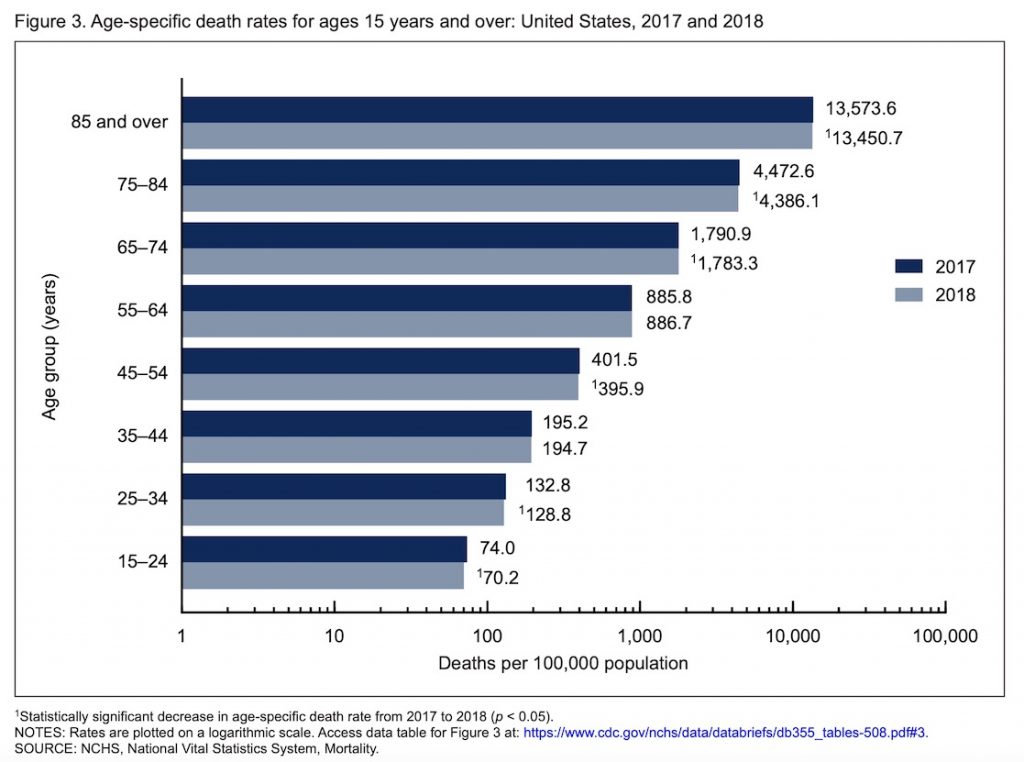
NCHS, between 2017 and 2018, mortality decreased across 25-34, 45-54 age groups. “death rates decreased 5.1% for age group 15–24 (from 74.0 deaths per 100,000 population in 2017 to 70.2 in 2018), 3.0% for age group 25–34 (132.8 to 128.8), 1.4% for age group 45–54 (401.5 to 395.9), 0.4% for age group 65–74 (1,790.9 to 1,783.3). Rates for age groups 35–44 and 55–64 did not change significantly between 2017 and 2018“
When we sum up the death rate by age groups (25-64) between years, below is the trend. The death rate actually decreased from 2017 – 2018.
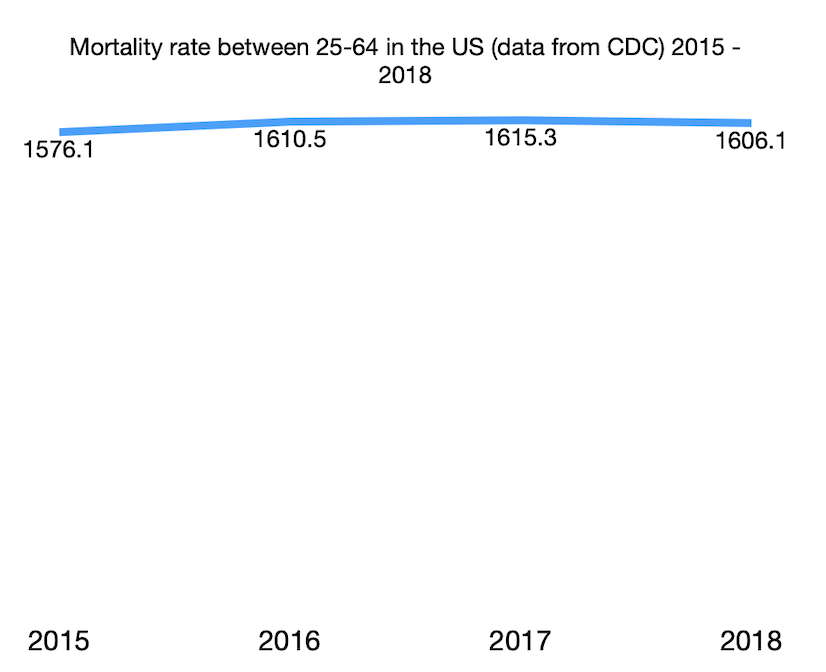
So, this sentence “A major reason for the decline in life expectancy is increasing mortality in midlife, between the ages of 25 and 64” is not entirely correct.
With the additional data points and context, my conclusion is that largely the overall narrative of the article “the Epidemic of despair” holds. It is a serious tragedy for the US. However, life expectancy is such a complex issue with lots of nuances. So certain claims are not entirely correct, especially when the authors try to compare between countries. I can make an educated guess on why Anne and Angus decided to leave certain data points out. Including many data points means the authors need to put in many caveats. And these caveats may distract from the main story.
Besides, I am reminded that I need to continue to resist making snap judgments when I don’t have enough data points/context. Assuming positive intent and giving others the benefit of the doubt are both important. Complex issues often require a nuanced narrative and trying to simplify the story is a delicate balancing act.