When Ethan Mollick wrote about how powerful chatGPT with Code Interpreter is, I was extremely curious. I was on holiday at that time so I only got the chance to play with it today. And boy, it blows my mind!
For context, I decided to use data about different US government security issues from the website Treasury Direct. I chose this data set because I wrote a previous blog post about “Why You Shouldn’t Believe the Hype About the TreasuryDirect Website Being Outdated” so I am somewhat familiar with the dataset. And more importantly, I roughly remember how long it took me to generate the graphs.
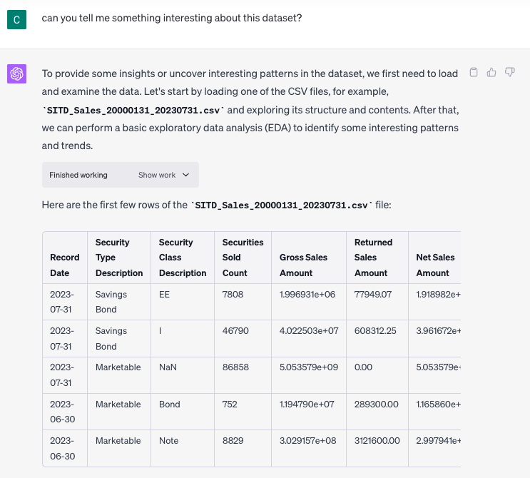
Uploading the entire dataset is extremely easy
Just with a click of a button, I can upload the entire dataset with the data dictionary as well. And I didn’t have to say much about the dataset, just these sentences from the website “The Securities Issued in TreasuryDirect dataset details how many of each type of Treasury bonds are issued, redeemed, or outstanding in TreasuryDirect from Fiscal Year (FY) 2002 until present. Outstanding bonds refer to those which are still in circulation, and have not yet been redeemed. The number of outstanding Treasury bonds is determined by taking the difference between the numbers of Treasury bonds issued and redeemed. This dataset does not contain any information on the values or yields of the Treasury bonds.“
I like the fact that without prompting, chatGPT tells me how it understands the dataset at a high level and gives me the initial rows of data as a preview.
Now I can start “talking” to the data
Can you tell me something interesting about this dataset?
I asked chatGPT a rather nebulous question “can you tell me something interesting about this dataset?” This is a super generic question because I want to see whether chatGPT can intuitively guess what might interest humans.
And this is the reply:
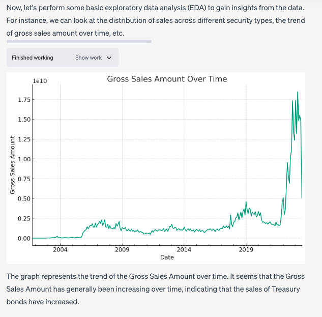
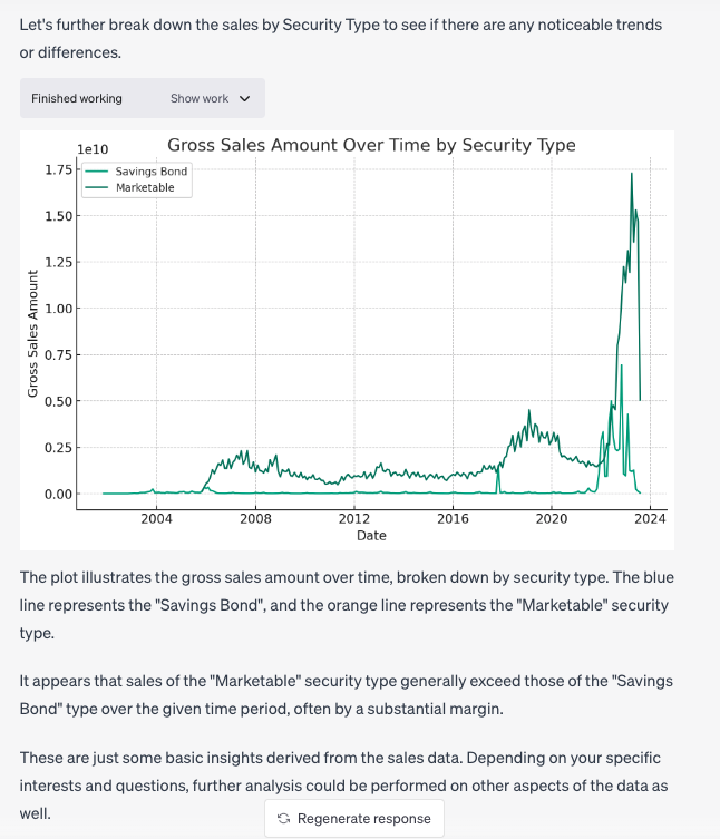
As you can see, chatGPT made the right guess that perhaps the gross sales amount trend over time is one of the first interesting notes about the dataset that I may care about. Then it breaks down gross sales by security type in the next chart. (If you notice carefully between the wording and the final chart, you can see that chatGPT said the wrong color “orange” instead of “darker blue”, but that is not a deal breaker).
Next, I asked chatGPT another nebulous question 😛
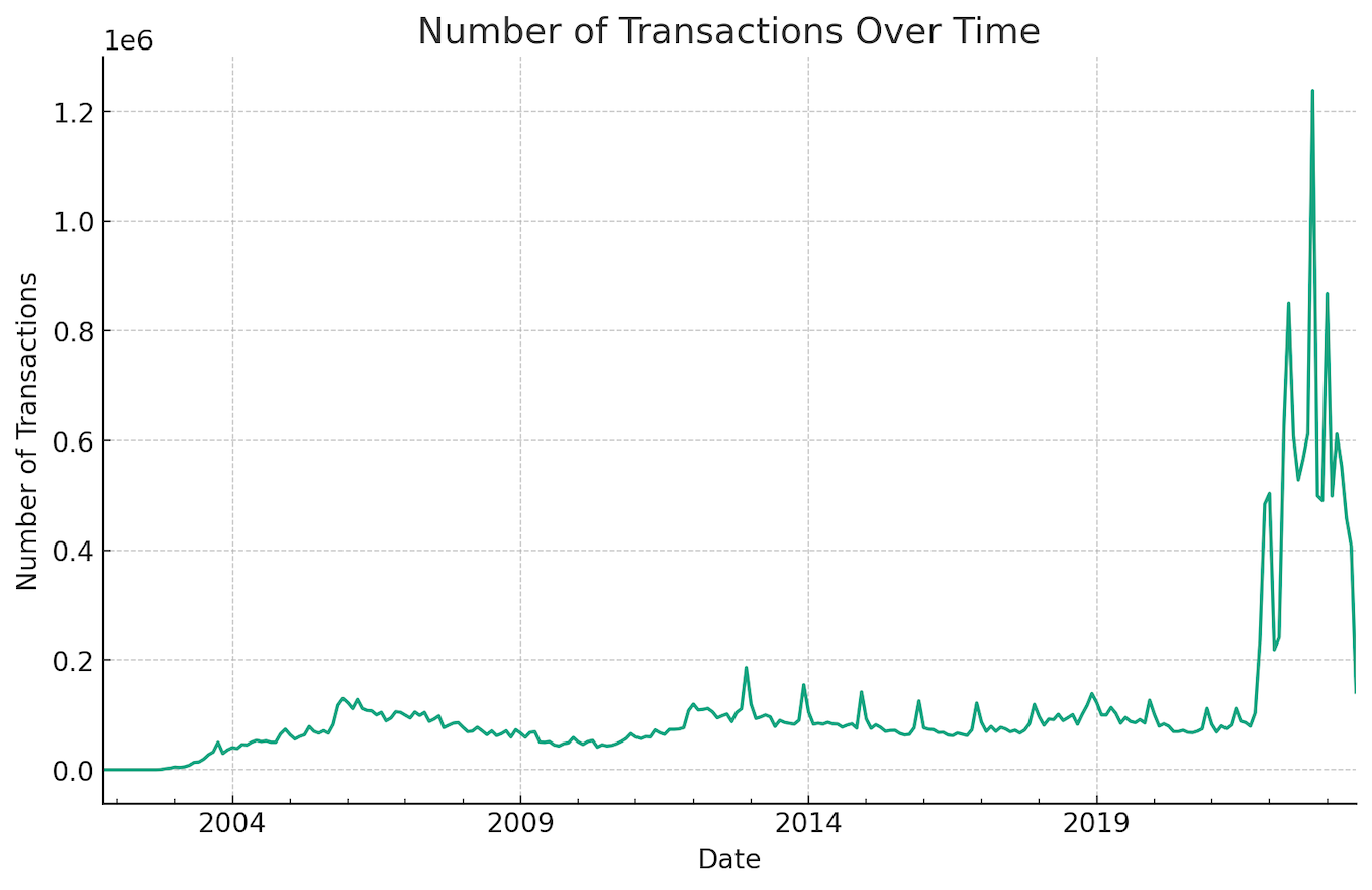
“Based on this dataset, do you think that the website treasury direct is getting more popular?”
And I like the answer it gave me “The popularity of the TreasuryDirect website could be inferred by examining the trends in sales and the number of transactions over time. If we see an increase in these metrics, it could suggest that more people are using the website to purchase Treasury bonds. However, it’s important to note that this is a rough estimation and might not represent the full picture of the website’s popularity, as there might be other factors at play.”
I like the response because the tone of voice is right. ChatGPT clearly states that it is unsure and the answer is just one of many possible answers.
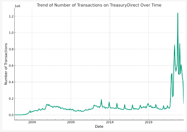
This is the graph that chatGPT generated
Iteration is the key
While the above charts are ok, they are not the final products that I am looking for yet. So I asked chatGPT “I want to include the chart about the number of transactions over time on my blog, can you reformat the chart so that it is easier to read?”
And you can see the improvement over time below, one by one:
First improvement
This is what chatGPT replied back to me after my request:
Absolutely, I can modify the chart to make it easier to read. Some changes that could improve the chart’s readability include:
- Increasing the font size of the title, labels, and ticks.
- Adjusting the linewidth of the plot for better visibility.
- Adding a more descriptive title and labels.
- Making the gridlines lighter to avoid distraction.
And this is the chart
Second improvement
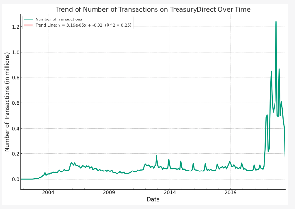
I noticed something strange with the vertical axis so I said this “for the vertical axis, I am not sure if my audience will understand what 1e6 means?”
and this is the result
“Understandable, scientific notation can sometimes be confusing for a general audience. Instead, we can convert the y-axis labels to millions and add that information to the label. This way, the numbers will be more straightforward to understand. Let’s make that adjustment.”
Third revision
This is my response after seeing the above chart “yes this graph is getting much better! I notice from the trend that the number of transactions increased significantly over the past few years. How do we show this better to my audience?”
and chatGPT replied:
“One common method for highlighting trends in data over time is to include a trend line in the graph. A trend line (also called a line of best fit) is a line that is used to represent the behavior of a group of data to see if there’s a certain pattern.
In the context of your data, adding a trend line can help visualize whether there’s an overall increase in the number of transactions over time, despite any short-term fluctuations.
Let’s add a trend line to the graph. We’ll use a simple linear regression model to estimate the trend. We’ll also include the equation of the trend line and the R-squared value (which measures how closely the data fit the regression line) in the graph’s legend to provide more context for the audience.”
While the chatGPT’s answer sounds confident, you can see that there is no red trend line in the above chat. So I provided my feedback
Forth revision
“I dont see the red line at all from the above chart”
and this is what chatGPT replied back:
“I apologize for the confusion. The red line representing the trend might not be visible due to the large fluctuations in the data. A trend line, especially for a linear regression model, may not adequately represent the data if there are large-scale fluctuations or if the trend is not linear.
An alternative way to highlight the trend could be to use a rolling mean (also known as a moving average). This technique averages out the fluctuations over a certain period to highlight the longer-term trend.
Let’s apply a 12-month rolling mean to the data and plot it along with the original data. This should help us better visualize the overall trend.”
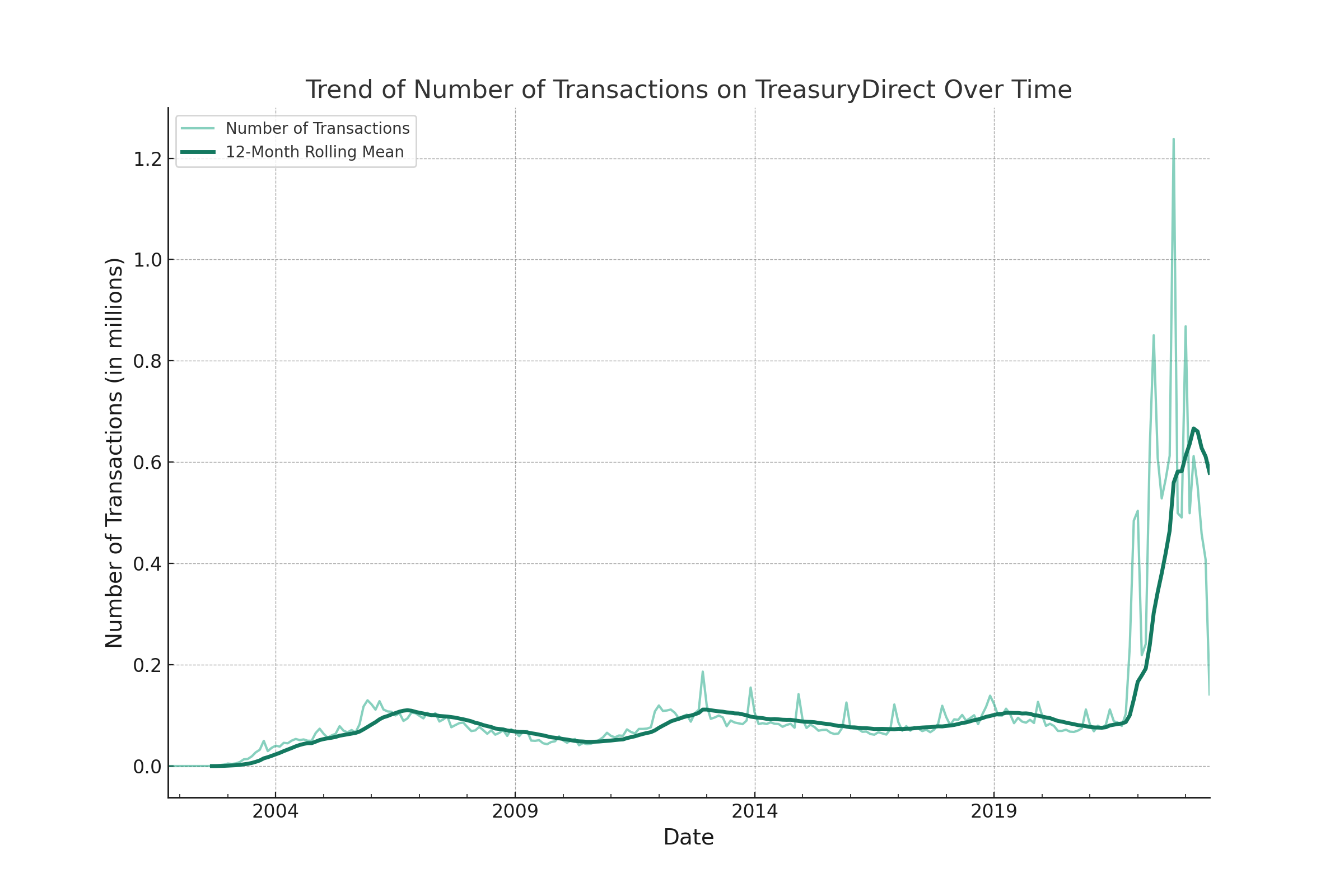
“A rolling mean smooths out short-term fluctuations and highlights longer-term trends in data. In this case, it’s calculated by averaging the number of transactions over 12-month periods.
The rolling mean line shows the general trend of the data despite the monthly fluctuations. As we can see, there’s a clear upward trend in the number of transactions, which supports your observation that TreasuryDirect is becoming more popular.”
Is it great? I didn’t tell chatGPT that I want to look at the 12-month rolling mean but it suggested it. Honestly, I didn’t think about this way to visualize the massive change over the past few years vs the past 20 years. Again super impressed!
You will notice the choice of color too, it purposely uses a darker color for the trend line to highlight the change, which is what I want.
Final revision
While I am already impressed by the last chart, I added this “actually, one additional question, do we need the gridlines for the above chart? do you think we can simlify the chart further by eliminating the gridlines?”
and this is what I received back
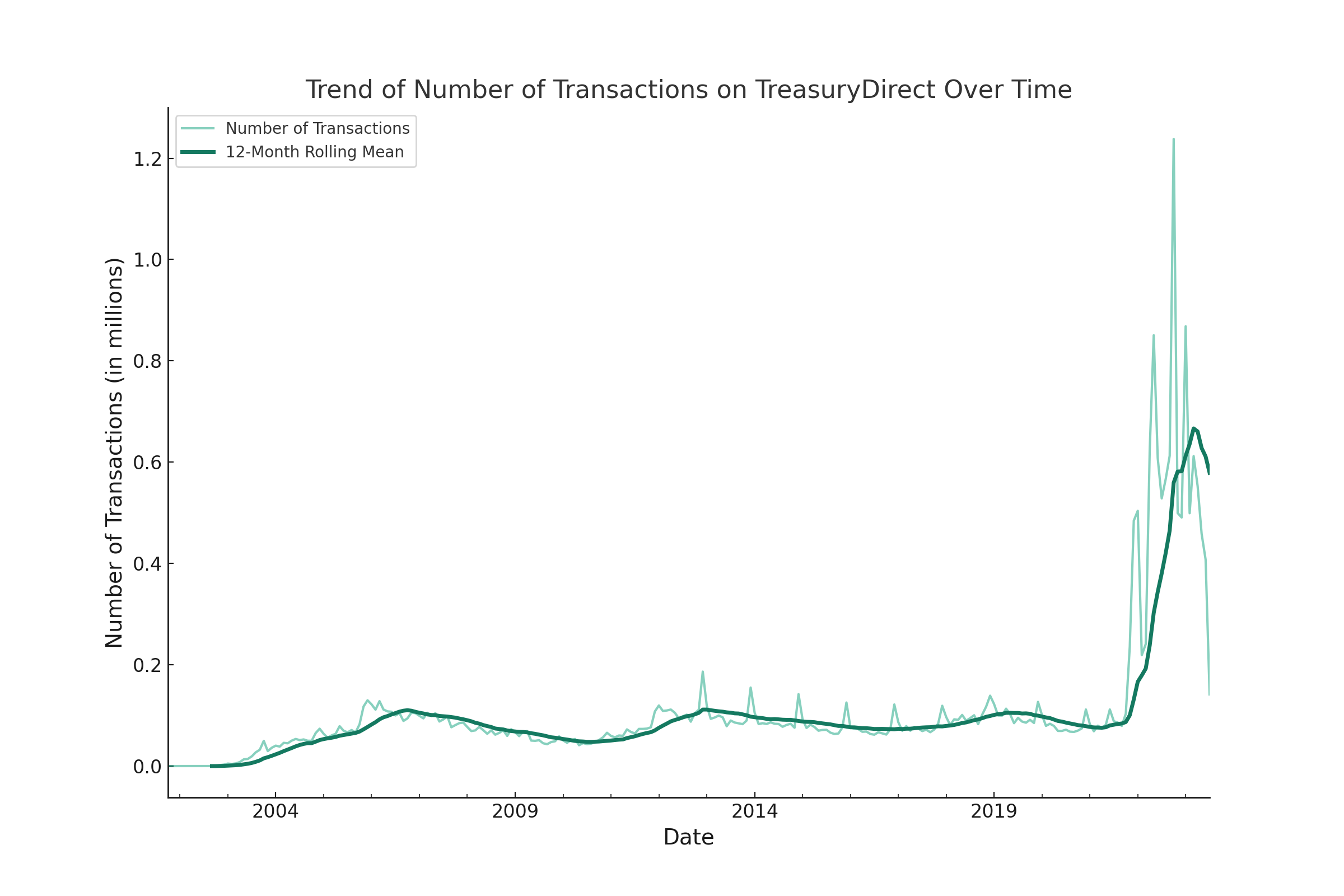
Reading this revision process, you may get the feeling that it is taking way too long but no, in real life, each iteration takes less than 5-10 seconds to run. It is definitely much faster than I am doing this by myself!
Direct comparison between my own chart and chatGPT chart
As mentioned above, I wrote a blog post using this dataset before so I created a few charts myself in the past. Now I want to compare how fast it will be to recreate the same chart but using chatGPT.
so I wrote this “can you generate a graph to show the trend of funded account at treasury direct from Jan 2016 to Feb 2023?”
Let me show you side-by-side my own chart and what chatGPT created. Below is what I created myself:
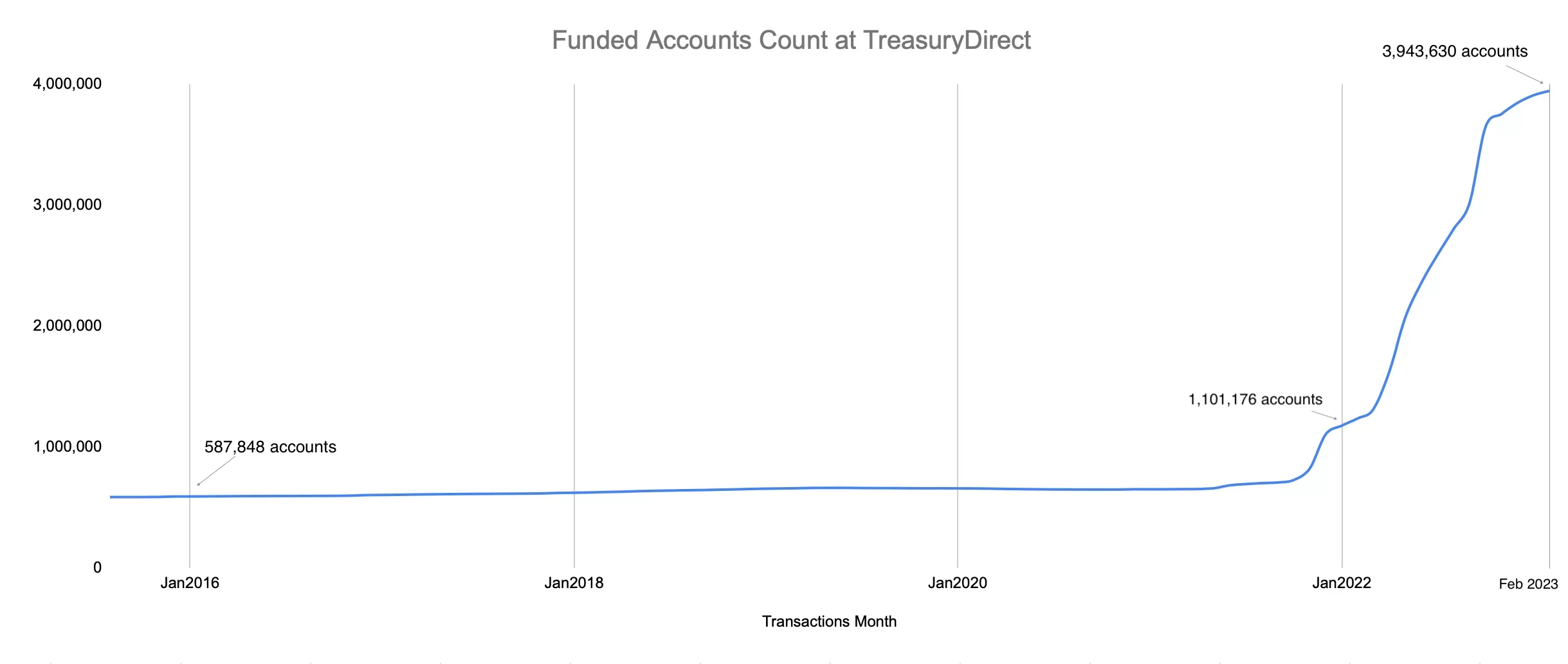
If I recall correctly, it took me more than 5-10 mins to create this chart before.
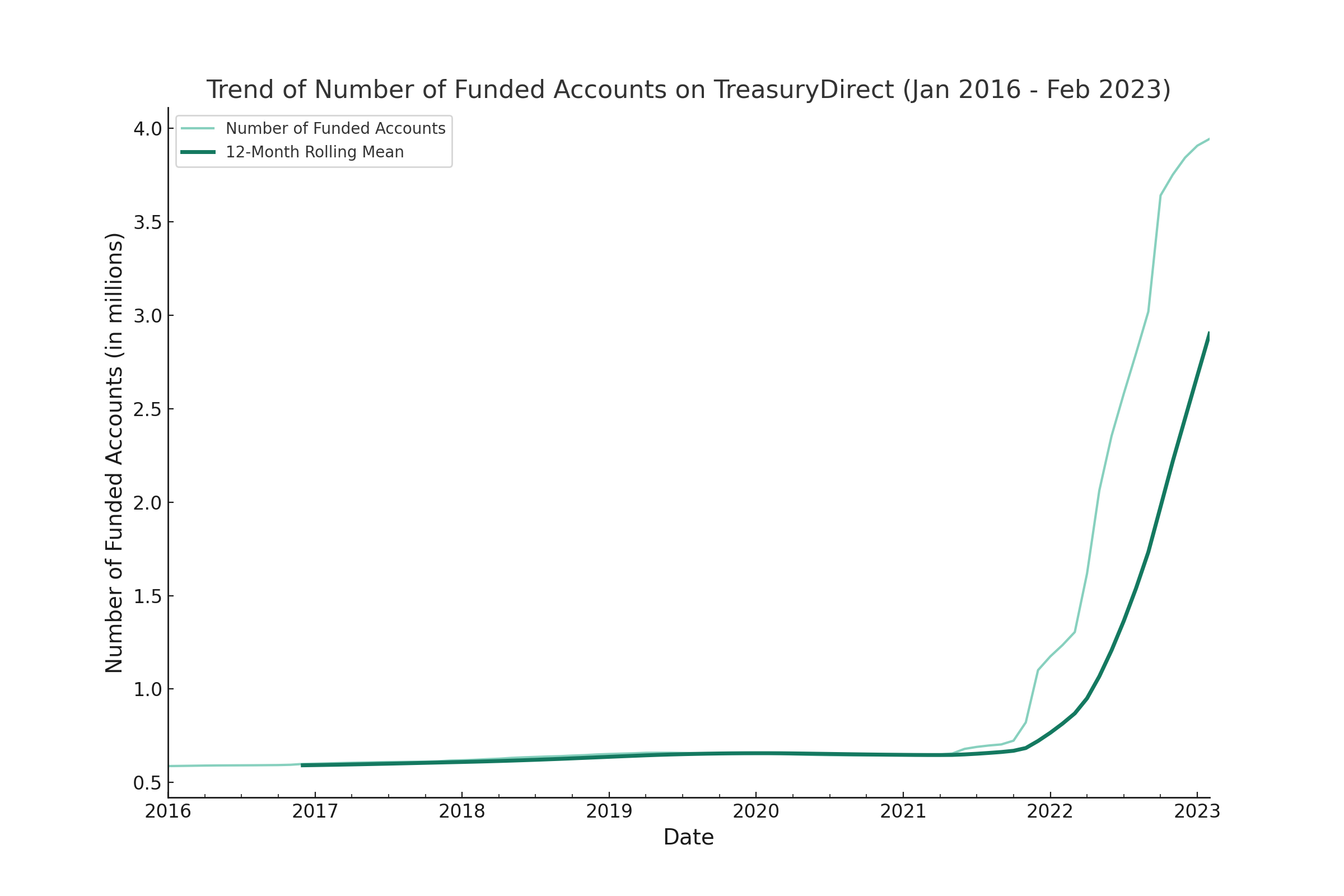
but with chatGPT, it took seconds and this is what I received (with the bonus 12-month rolling mean). You are the judge of which version is better 😛
Conclusion
I am blown away by what chatGPT with code interpreter can do NOW for data analysis and can’t wait to see what it can do in the future, with even more improvement. Let me know what you think. And also, please share your own experience with chatGPT and code interpreter 🙂
[jetpack_subscription_form]