I have come across so many websites (including my own), products/services, so many sign up forms, so many contests that I will be of absolute lost trying to complete certain critical tasks. Because of these experiences, I’ve always wanted to learn more about User Experience, not just for website but how to bring good overall experiences of a product/service to users/customers. And they said that the best way to learn is to teach so while bearing in mind the risk of sounding too ignorant and a complete amateur when it comes to user experience, I put together some materials on this subject.
I talked about this in my latest book about Vietnam Digital Marketing Fundamentals as well.
Recently I came across this watch.
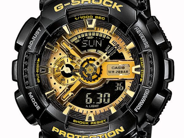
FYI I almost bought it. It is one of the classic Casio G Shock watches. It looks quite cool and actually looks better when you wear it. However I didn’t buy eventually because as a watch, I can’t look at the analog watch and figure out what time it is. Being able to show what time it is, is THE basic functionality of a watch. Don’t get me wrong, I think many people would buy this watch because of its design and I saw a number of pedestrians wearing it actually. Everyone is different.
Enough introduction, Now let’s dive in.
Insufficient attention from marketers in Vietnam
I have to say user experience is an area that doesn’t receive sufficient attention from the digital agencies, marketers in Vietnam in general. While it is not new, it seems like everyone is looking for a beautiful design and not necessary a user-friendly site. Also, the agency may say they care about user experience during pitching, however, it may not happen during the execution phase. (duh!) Lack of time is the common excuse, lack of budget from the client is another common one. Lack of expertise might be another reason as well. The truth is there are not that many user experience professionals in Vietnam.
User Experience is hard or is it just common sense?
User experience is hard because it requires so many disciplines to come together. From Jodie Moule point of view, it requires: interaction design, human factors engineering, industrial design, psychology, anthropology (anthropology definition is here), sociology, computer science, graphic design, cognitive science. There are many factors that influence the experience of an user with a product/service as well:
- Usefulness
- Usability
- Learnability
- Aesthetics: does it look nice?
- Emotions
By the way Jodie Moule wrote a good book titled “Killer UX Design”. The Killer UX Design is quite applicable if you are working in an agency because the author writes from an agency angle. Jodie didn’t just talk about User Experience on the web alone, she discussed generally about all of the touch points that you may have online/offline with your users/customers. This is a powerful concept to note because more often than not, under Owned Media Channel alone, we would have website/microsite, Facebook fanpage, You Tube Channel etc… Not only that users use desktops, laptops, smartphones, tablets to access these properties so we need to ensure a pleasant experience during the entire user journey, from the beginning, when they first come in contact with us, what do they after that and then where they would go when they finish.
For amateur, a lot of stuff for User Experience should be easy and common sense. It comes from an understanding, a focus on user’s need while designing, building a product/service/website. “Don’t make me think” by Steve Krug is probably one of the best, easy to read book for amateur like myself.
The title of book simply summarizes it all for us, doesn’t it? Our job is NOT to make users having to think too much just to use the website/application. Everything should be natural, obvious to users especially the key call to action.
If you want to go further and conduct usability test yourself, Steve Krug has another good, simple to read book called “Rocket Surgery Made Easy: The Do-It-Yourself Guide to Finding and Fixing Usability Problems”
Amazon has one section about best sellers in User Experience and Website Usability so you could check that out as well.
Because there are so much materials on this subject already so I don’t want to reinvent the wheel here. I would strongly recommend you pick up a few books on User Experience and read them.
However I also understand that some of you do not want to read too much and just want some practical tips that make your life easier. So here is the checklist of basic things that you should look at
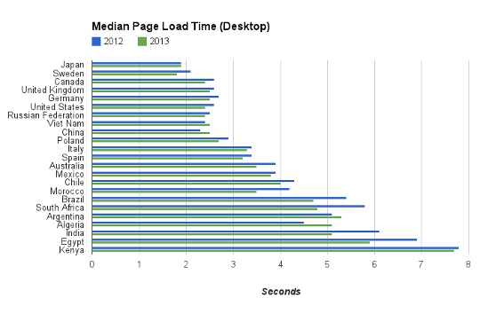
Speed matters
As you could see from Google report, the average loading time for a site in Vietnam is around 2.5 seconds so if the site takes like 15 secs to load, something is not right. User doesn’t want to wait when it comes to the internet and 20 secs is a “long time” online.
There are many articles on how to make your site faster, including articles from Google.
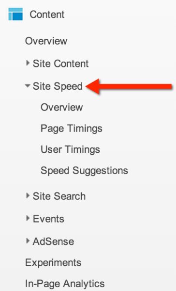
I don’t care how beautiful, useful, rich your website is, if it takes 30 seconds to load the site, I am NOT interested. If you have Google Analytics installed on your site, you could look at the page speed report under Content category.
First impression counts
Could you easily understand what the site is about? which site it is? Which section/page of the site you are on? Is it obvious to you what you could do from where you are now?
If it takes you too long (like 20 secs) just to find out where you are, what you could do here/how to start, the information architecture of the site might be too confusing or the design is too complicated.
If there are terms in the main navigation that you are unsure what it means, then it’s probably not user-friendly enough. While it’s true that certain site requires user with domain knowledge to use because they are highly technical. However, my challenge to those site owners is: “Would you want more business?”, Would you want more business from people who are NOT your customer previously, new customers? So making things as simple as possible for people to understand is of paramount importance to attract these new customers.
The overarching principle here is again “Don’t make me think”.
Where am I? Where could I go from there?
To help user understand where they are on the site, what options do they have at this level, we could use breadcrumb and other design cues. If you don’t know what breadcrumb is, please refer to the screenshot below:
![]()
Also, it is important that users could search the site if they get lost. This is a very important function. However, I am ashamed that my site the search function is not very good!
In my opinion, the internal search function is no longer an option but a MUST (of course if your site has only two pages, you probably won’t need search function). Internal search function is basically the search button that allows users to search for stuff on your site.
A real life analogy would be if you can’t find what you are looking for or get lost in a department store, you basically have two options:
- You look up at the signs to understand where you are and look for the areas where you want to go. i.e. look at main navigation
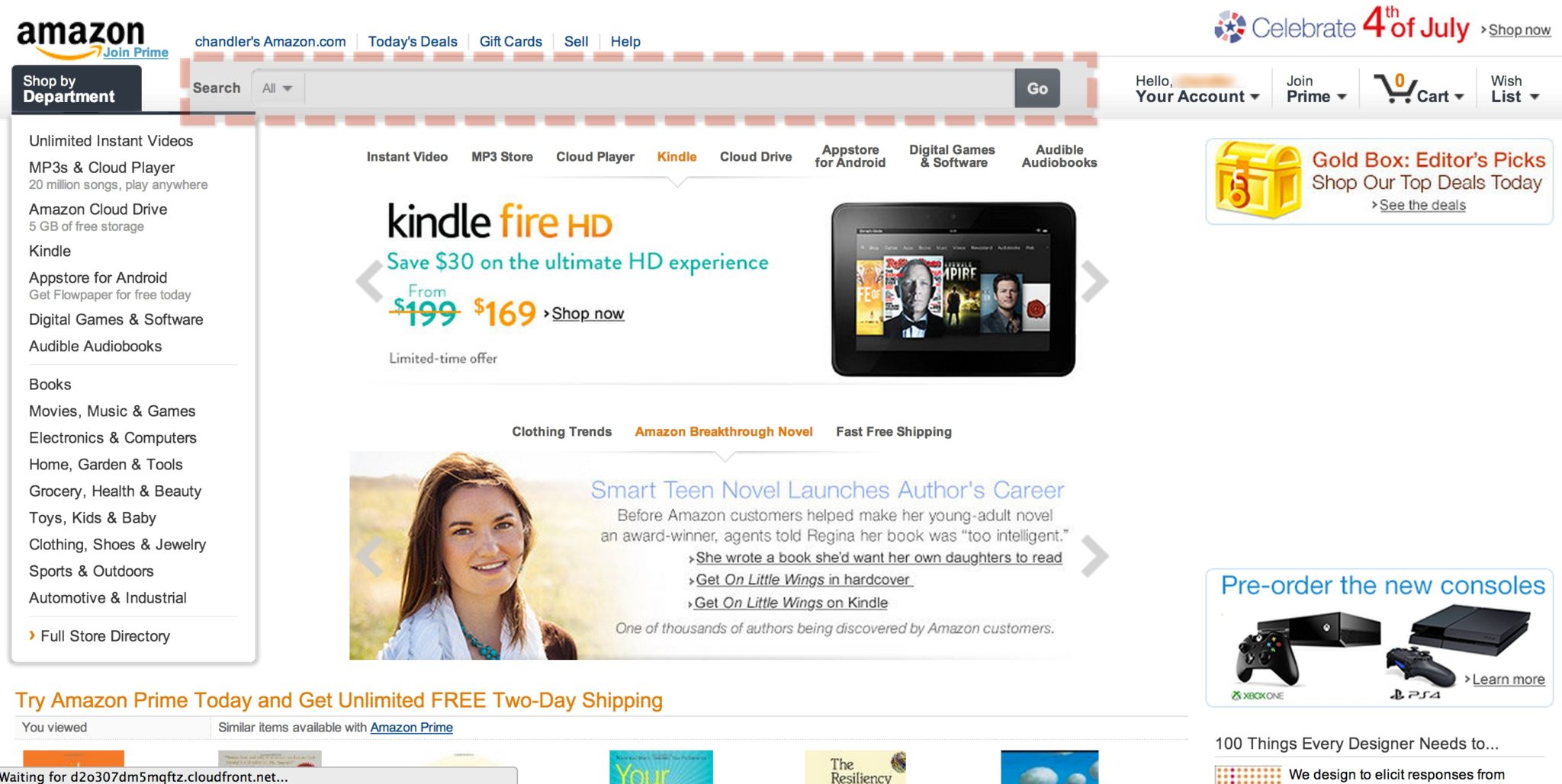
- You ask any store assistant near by about how to find the jewellery section or kid section etc… this is the equivalent of the search function when it comes to online. I am often very lazy and always ask the store assistant so when it comes to online, if I can’t immediately find what I am looking for, I would use the search function. Amazon, one of the biggest e-commerce site has a very robust search function, which makes life very easy to users.
Basic accessibility issues
Text to background contrast: Text should be easy to read, and have enough contrast with the background like black text on a white or slightly grey background. Please do not try to use dark blue text on a black background or blue background etc…
The example below doesn’t have good text to background contrast besides other stuff like trying to explain a location using words?

Another thing would be font size and spacing. I would argue that anything less than size 10 is not easy to read on the web. May be I am getting old but I will not waste time trying to read small text.
Clear visual hierarchy
We could spend a lot of time discussing this point. Essentially it is about the more important thing is, the higher they need to be on the page. Important content should be above the fold.

The above is LITERALLY the “above the fold” part of a landing page after I click on the banner on vnexpress. If you are an user, what do you think?
Also, the more important headline should be in bigger font compared to less important one.
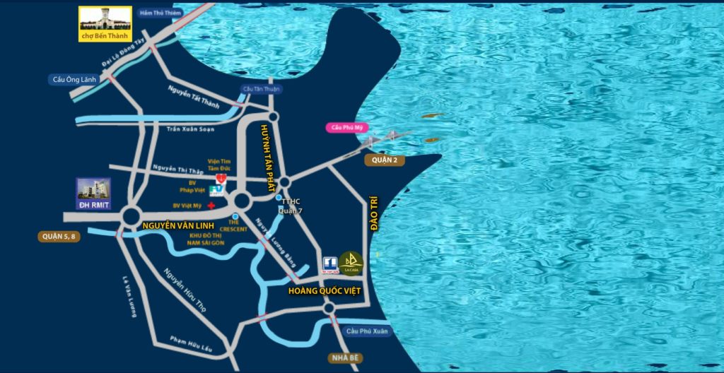
Please look at the below screenshot and guess which information it is trying to convey i.e. which is the important information from this map? The context of this screenshot is that it is the location of a real estate project. Could you see the project anywhere on the map? I couldn’t find it after like a minute looking at the map, under the Location menu.
Things that are related to each other logically should be close together physically. It is like how you would arrange merchandise in a supermarket. You don’t see fish and dry food mixed together in one section, do you?
Following convention is important
Some of the conventions are:
- Site ID needs (logo) to be clearly stated and more often than not, it is on the top of the page. It is at the top left corner or top center location more than top right corner. Have you seen the site logo on the top right corner before?
- Company logo should link back to the homepage
- Make clear which part is clickable: by convention, blue & underlined text is clickable (even blue text only in some case).
- Don’t use self invented icon without text to support it. This is applicable to self invented abbreviation as well. It may make you sound cool because you use some newly invented abbreviation but it is NOT good for business. If people don’t understand something and you are NOT there to answer their questions (it’s online remember?), then it just turns people off.
- Site search should be on top centered position or top right position.
Ability to complete Key actions
This is consider the most important aspect of all. If user could successfully complete what you want them to do easily, without hiccup, you are a star! If user can’t do/fulfill what they want from your side, you are doomed no matter how “pretty” your side is.
List down the top 3-5 key actions you want users to do while they are on your site. Then write 3-5 scenarios that match these key actions so that if you ask someone else to complete these tasks, they would have the background information. This should be easy and almost anyone from marketing to IT to sales could make the list.
NOW test this list with someone who is NOT from marketing team, creative team, sales or IT team. Basically what I am looking for is either you test it with your target audience, or since your target audience would tend to be quite wide, you could test it with anyone who is NOT involved in building, designing, maintaining the site. Hopefully you won’t be as surprised as I was in many occasions.
Some examples are below:
- If you want to invite people to a party/event that you organize, it’s best not to direct them to your PR news page or put your offline brochure online. I came across brochure type landing page, in which users have no clue how to register. They basically have to scroll down for about 5 pages to see a very small call to action at the bottom about register here for your free tickets.
- If you are a fast food chain and you want users to the site to call you and order, your PHONE number should be visible on the homepage and on as many pages as suitable. Don’t try to hide it somewhere else.
Some other small things
So I would include a few common “mistakes” for website/microsite that I have seen so far here so that you could watch out for them:
- Sign up form with only 1 field for password, no field to retype password??
- Sign up form that asks way too many personal information without good reasons.
- Sign up form that once you click the submit button and there is something wrong, everything is gone and you have to retype everything! Come on it’s 2013 and users should NOT have to retype all fields in the form just because something is wrong. Retyping the password or CAPTCHA is understandable but not everything like name, email, etc…
- Status bar while uploading a photo or video: with the relatively slow internet connection in Vietnam, it is very important that if we ask user to upload something, we should have a status bar running so that user know that it is in progress, or failed or how much more time they need to wait?
- Auto play video with sound ON: I know as a marketer, we want people to watch our video, especially if it takes thousands of dollars to produce. However in my opinion, auto play video with sound ON is a big NO NO. As a user, my first reaction has always been to turn off that video and sound no matter what i.e. I don’t bother to wait and watch to see what the video is about.
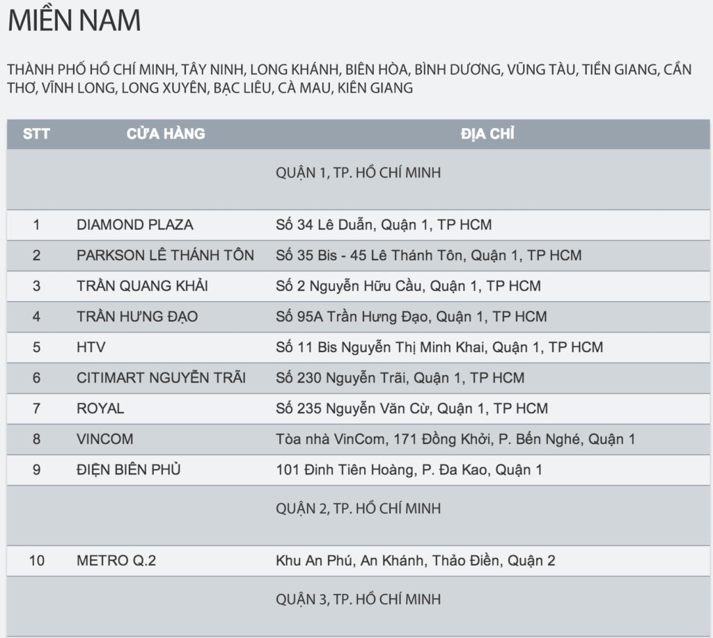
- Location without map: more often than not, we would have locations of our offices, our stores, our restaurant on the website and we want users to visit them. However just listing down the address without the map is sub optimal. Google Map is pretty accurate and easy to do so just tuck it in there so that user knows how to get to your store/your restaurant etc…
The listing of stores below to me is sub optimal.
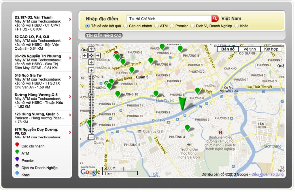
This one is much better. It has detailed address, phone number, map etc…
- Logo that is NOT clickable! This really kills me. It is a very common habit that people would click on the logo and expect to go back to the homepage. Having a logo and it is NOT clickable just sends the message that you do NOT care about your users.
That’s about it from me. Please share your experience, advice to make this list more complete and useful. I am sure I miss out a lot.
Thanks,
Chandler
P.S: This chapter is included in my book about Vietnam Digital Marketing Fundamentals as well!
Update 1: 13Jul 2013 There is an useful, simple checklist that I found from Dr. Peter J. Meyers “25 point website usability checklist”
Update 2: 28Oct2013. A must read with 28 fantastic tips on User Interface http://goodui.org/