Hi,
Today we will discuss reporting, which is really important because everyone either writes it or reads reports at some point in their professional career.
I use mainly digital marketing monthly campaign reports in this post as examples but the principles hold true for other types as well.
A report could easily show writer’s analysis ability, understanding of the subject, critical thinking, problem solving and more often than not English proficiency as well.
With Digital marketing, there are many numbers, many things to look at so we have the tendency to include EVERYTHING in the report. It’s not the lack of data but “data puke” is the main issue with reporting. Let’s discuss a couple of issues one by one
1. Purpose of reporting
Why do you think we need to do monthly or end campaign reports? or any type of reporting at all?
To make our boss happy? To make the client happy if you are from the agency side? or because monthly report is in the project requirements?
Well there could be many reasons for reporting: from keeping track of what’s going on, fulfilling the requirement of contract liquidation, proof of live campaigns etc…
For monthly and end campaign reports, I think we could agree that the purpose is to understand what was done, how the results was (good or bad) in comparison to the prorate KPI and give any actionable insights/key learnings moving forwards.
I would urge everyone involved in a projects, whether from the agencies or the clients to discuss and be on the same page on what the reporting purpose should be? I know this sound basic (stupid even) but when you dig deep enough, you start to realize that because there are many people of different management levels involved in a project, their reporting needs/purposes are very different.
For top management, they would care about the big picture, the campaign overall objectives & achievement, the trend, how marketing data related to sales, to brand awareness that could be quantified by third-party reports.
For marketing executive taking care of a particular activity, they would care about how that activity is being executed, how the performance of that activity is compared to the KPI, compared to previous campaign (if any) etc…
2. Length of a typical report
Should a monthly digital marketing report or end campaign report have 100 pages or Powerpoint slides? How about 200 Powerpoint slides? or 300 slides?
To address this issue, let try to put ourselves in the shoes of those who read the report. How much time do you think your target audience often spend reading a report? Is reading your report the most important thing in their daily work? Do you think your target audience would be waiting for your report to arrive at their mailbox or they are busy with their own to do list?
Would the recipient spend 2 mins reading your report? or 5 mins? 7 mins? 15 mins? or they don’t even read what you prepare? The general idea is that if you send a report out and there is no feedback about it, there is a very high chance that the recipient doesn’t even read it. So all of your time & efforts, all excel manipulation, Powerpoint slide animation go to waste.
I hope by now you come to the conclusion that reading monthly digital marketing report, or end campaign report is not something your recipient is super excited about and they are not going to spend a lot of time reading it, at least not the first time. So what’s the point?
The point is that if the normal human reading speed is 2-3 slides per minutes and your target audience likely spends about 10 minutes reading your report, how long do you think the report length should be?
In that short period, what message are you trying to convey? what actions do you want to recommend your recipient to take or to approve?
3. Proper structure of monthly report
I really hate long reports, especially those with lots of data but no actionable insights or too complicated that you have to read so carefully and trying to understand what the slide is about. In my opinion, the ideal report length should NOT be more than 20-30 slides. It would be best if you could keep it within 10 slides or less.
In any normal monthly report, I feel that the following should be there:
- Top line results related to the objective
- Are we on schedule to hit whatever overall KPI based on the rate that we are going?
- What we did last month? what worked, what didn’t? WHY?
- How last month results were in comparison to the months before/last year or our competitors? WHY?
- Recommendation & next steps
Long digital marketing monthly report often indicates you have no idea what you are talking about or you do not see the big picture. Clients hire agency to make their lives easier, not more difficult by reading hundreds of slides every month. Throwing all possible data to the client do NOT make you sound sophisticated.
4. Proper structure of end campaign report:
With end campaign report, the must have should be:
- Overall campaign objectives: just quickly say this so that someone brand new could understand
- Overall campaign KPIs
- Our achievement: please go straight to the point and answer YES we did it or NO we failed in hitting the business KPIs, campaign objectives
- Analysis of a few (less than 4-5) key top line results
- Conclusion/recommendations for next campaign
5. Data authenticity:
Wrong data is worse than no data. Because at least with no data you could not draw any conclusion. You would continue to look for more data to validate your hypothesis. However with wrong data, you conclude the wrong conclusion and give wrong advices!
So please double, triple check what you put in your report. Make sure you understand the terminologies that you put in.
I have seen more often than not traffic from one channel reported by the agency is more than the total traffic to the site!
6. A few examples:
- Please make sure your slide title match the content of the slide in your reports.

Could you verify the graph and the text analysis on top of the graph? One talks about % and another one is in absolute value. Did you spot anything else?
- Please do not copy and paste a long table with 10 rows and 10 columns from excel into Powerpoint. It is really difficult to read complicated tables with so many roles and columns. Ask your self: could you delete any rows/columns and still could communicate the same message? Could you turn the table into chart and make it easier to understand?
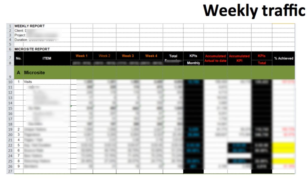
- Also, please do NOT put in too many words, too many tables and no graphs, it makes reading the report so painful and difficult. I am a big fan of simple graphs/pictures that could tell a meaningful story.
The above slide is really bad because the title, the content and text are so painful to read.
Why we are having so many rows and the text part only talks about two rows in particular. What are the rest of the rows for? certainly they are not for fun!
And did you read the conclusion text? could we try to do this in a civilised way by using some graphs?
- Please do NOT try to communicate 3-5 different things on the same slide. It will make what ever content you put in that slide really complicated and messy. One example:
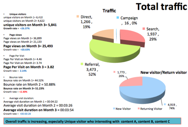
As you could see from the slide above, the slide title, the slide conclusion and the content do NOT related to each other. I don’t see any data about content A, content B or Content C on the slide to conclude that we have an increase in traffic because of those content. I have no idea why new visitor and returning visitor graph or traffic source graph are there? What does that even mean? Are we having more new visitors compared to the month before ??? Is that even good or bad?
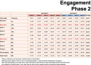
- Overly complicated table
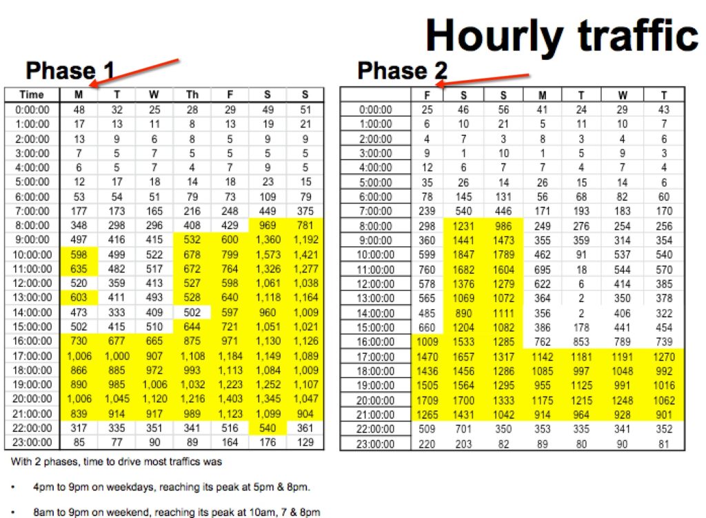
This is another example to show that OMG what a complicated slide and I don’t know if there is actually anyone who cares enough to look into this slide and trying to understand what that even means?
Why the two tables has Monday and Friday as start of the week? What the ****
and knowing the time of the day, day of the week that bring in most traffic, could help us to optimise the campaign how? Unless you could tell me why I should care about this information, please DO NOT put this slide into the end campaign report because it is badly done, makes no sense and just shows that you are not competent enough with your analysis skill.
That’s all from me. Do you agree? Feel free to share any comments/examples.
Thanks,
Chandler