So with millions of smart phone users, using their phone every day, what we could do to take advantage of it?
“For ever-increasing numbers of consumers, across markets, income levels and demographics, the mobile phone is the device and the communications channel closest to their hearts. It is by definition intimate and personal, carried everywhere, used throughout the day and customised through taking and saving personal photos, downloading music, adding wallpapers, creating shortcuts and, increasingly, through the selection of apps and functions.” From TNS Global Key Insights Mobile Life.
Because of this, smartphone represents a major opportunity for brand to have an intimate, one on one relationship with its customers.
From owned medium point of view, we would have options like
- developing a mobile site
- a native mobile app
- leverage on existing social networks like Facebook, Twitter, Instagram.
With mobile site, you can’t take advantage of different functions like access to photo album, camera, videos, contacts and others. The experience is not likely to be as rich/interactive as with native mobile app. However the good thing is a mobile site is platform agnostic i.e. it could run on both iOS, Android or Windows. As for Native App, you could build really complicated app with rich experience, beautiful graphics, 3D images etc… However, it is very important to know that you would likely have to create different versions of the same app for iOS, Android, Windows Mobile or any other operating systems.
Is your current site mobile friendly?
To answer this question, you could try to visit your own site on a smart phone or you could use Mobile phone simulator (i.e. just search online for “How does your site look on mobile?” and you will find many free tools).
If your site made of flash, then you would NOT be able to see anything on iPhone (or any iOS devices like iPad, iPod Touch) because iOS doesn’t support flash.
Some tools will give you some hints on how to optimize your mobile site. Questions they ask could be like:
- “Do you see broken images or missing content?
- Can you read the text without zooming or scrolling side to side?
- Can links and buttons be clicked with a thumb?
- Are videos, games or other animations visible?
- Are visuals and tone consistent with other marketing materials?”
By answering these questions and knowing how much time your mobile site takes to load, I guess you could have a very rough idea of how your mobile site performs and what area you should look into to improve the site.
Again the above list is very basic and there are many other things else to check to know whether your site is mobile friendly.
Mobile friendly site
In Vietnam, when it comes to developing a mobile site, from a technical point of view, there are a couple of options for you:
Responsive Web Design
Responsive web design (RWD or Responsive Design) is relatively new so there is still a long way to go for designer and developer to master this concept and bring it to life beautifully. There are many examples of a responsive design website like http://mashable.com/, http://www.bostonglobe.com/ or my own blog uses theme that supports responsive design. I haven’t come across many sites in Vietnam that implements Responsive Design.
From “Think Insights with Google”, they wrote “Responsive web design (RWD) enables you to optimize your site experience across different screen sizes without creating multiple websites. By using flexible templates, CSS media queries, and JavaScript events, a responsive web design can respond to the viewport size of a device, adjusting images, template layout and content visibility. You can even harness novel device capabilities such as dragging, swiping and other user-gestures recognized by touch devices. All of these CSS and JavaScript techniques can be layered onto a single file of HTML content, delivered to all devices.”
Example below from Mashable to feature responsive web design in case you are not sure what it is:
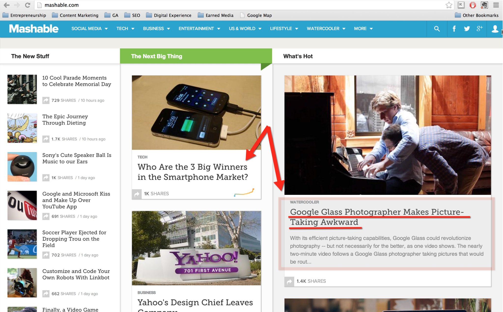
This is the normal screen size for desktop (I am using Macbook Pro and the resolution is “best scaled”), you notice that the title of the article on the right hand side “Google Glass Photographer Makes Picture Taking Awkward”. If you look at the highlighted portion, you could see the article has title in 2 lines and some descriptions below.
Now take a look at the below picture for iPad screen size. If you want to replicate this, you just need to reduce the size of the browser window.
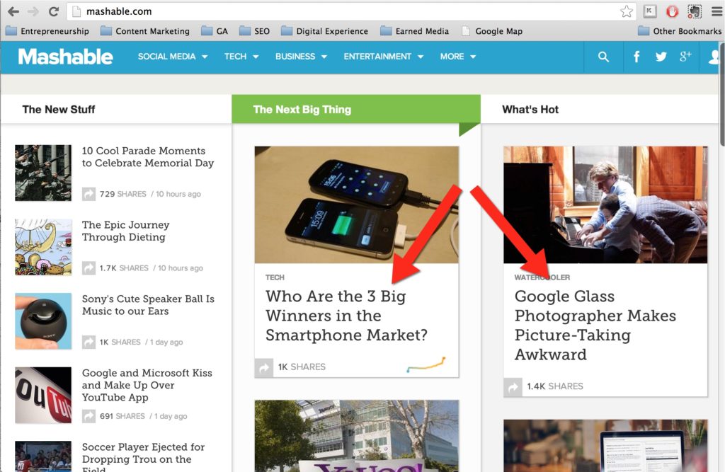
Because of the smaller screen size, the article title now appears in 4 lines, we don’t have space for the article description anymore. However as you could see, the layout is responsive and our view is still optimal. The layout doesn’t break and you could still read the content easily.
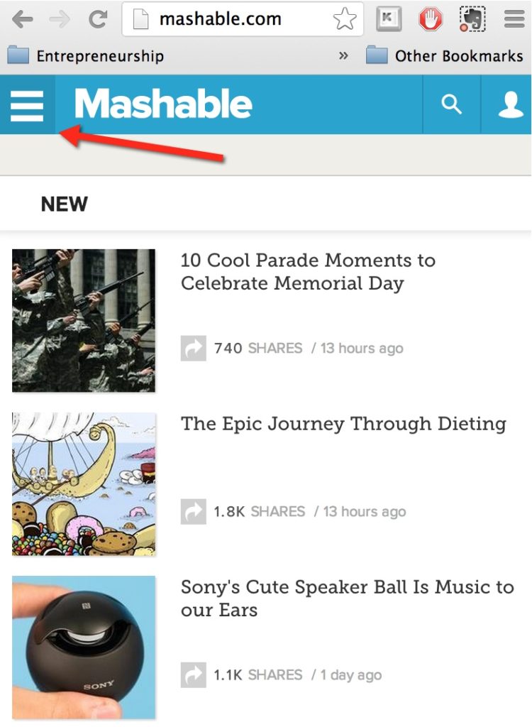
The last example is the smart phone screen size for the same Mashable site. As you can see, the layout completely change to cater to the small screen size. You see only the New section on the homepage. The main navigation reduces to the button at the top left hand corner. If you want to go to other sections, you have to click that button.
Mobile site: Dynamically serving different HTML on the same URL
When a customer visits your website, it’s possible for your webserver to detect what kind of device they’re using and present a custom page (HTML + CSS) on the same URL. These custom pages can be designed for any kind of device—mobile phones, tablets, desktop computers and even Smart TVs. Detecting the user’s device and changing the content you serve requires some customization (e.g. stylesheets) that need to be maintained on a per-device basis.
Separate mobile Urls
Another option to customize user experience based on device type is to build a separate site for mobile traffic, independent of your original desktop site. The browser detects if a visitor is on a mobile device and redirects them to the mobile-optimized version of your site (e.g. m.vnexpress.net). A dedicated mobile site allows you to tailor the site specifically for mobile users and is often independently built and hosted.
This solution is quite commonly used in Vietnam. Some of the biggest news portals in Vietnam use this type of implementation like VnExpress, Vietnamnet (2013).

Mobile friendly site or native mobile app?
From budget point of view, the option with lowest budget would be to have a separated mobile site i.e. separate mobile URLs. Responsive Web Design would be more expensive generally in comparison to the mobile site. And of course, building a mobile site with responsive design is much cheaper in comparison to native apps. If you ask for how much cheaper exactly for mobile site vs native app, again my answer would be that depends. I would estimate the ratio to be between 3-20 times more expensive to have a native app depending on functionality as well.
Besides the fact that it takes less money to build, mobile site has the advantage of reach, compatibility across platforms, browser. User could find the mobile site pretty easily just by searching on Google.
For responsive web design site, it inherits all the above advantage of the mobile site, plus it offers much better user experience across devices due to custom layouts. If you want to update your Responsive web design (RWD) site, you could do so via CMS quite easily. The changes would be live on user’s browser instantly without approval from third party like the case of Apple AppStore.
Both “normal” mobile site and RWD site have some very big disadvantages like:
- Many of them can’t function without internet connection ( From my limited understanding, there are some Web Apps that offer offline mode)
- They can’t access user’s personal data on the phone itself, the camera, calendar, photo stream, accelerometer etc… (This might change in the future)
- They generally don’t offer as rich user experience as native app since complicated animation, games, reporting, calculation etc…couldn’t be implemented easily.
- Push capabilities: If you want your mobile site (web app) to run on the background and send you notifications, it is not possible at this point
- The ease of monetization: with Google Play and Apple App Store or other marketplace, it is much easier to market native app and reach a massive audience that may pay to download your native app, or purchase in app items. For mobile site, subscription model seems to be amongst the few choices available for monetization.
One big disadvantage of native app is that in order to provide best user experience, the app needs to be customized/built for each platform i.e. one version for iOS and another version for Android. This would mean development cost is higher for native app. Maintenance cost is higher as well.
Mobile site disadvantages are native app advantages naturally. However be aware that native app is just like social media asset or a website, once you build it, you need to spend money to promote it to your users and maintain it afterwards. So I would not recommend developing an app just for a 2 month campaign and then stop supporting it after that.
Native app development flow
If you want to build a native mobile app, the general flow is like this:
- Ideation: this includes the app concept, key functionalities. Normally it would be better to think about the long term benefits of the app (for both users and for the brand), not just for a campaign burst (1-2 months) because the cost of building an app, promoting it for user to download is not small.
- Business analysis: analyze the requirements and suggest suitable technology solution, foundation framework for each operating system,
- Wireframe, Design: Just like creating a website, wireframe is critically important for an app because it is the foundation of the user interface. If there is anything logically wrong with the wireframe, or anything missing, user experience would be affected severely.
The screen flow would explain how the animation would function. With the screen flow, client would be able to “visualize” how to use the app, what happens when a button is touched.
- Database, CMS and API: this stage is about designing the database, coding the CMS and API according to the requirement. You could code the CMS and API using php or Java or .Net, it’s up to you. Please note that your “normal” web production team could handle this part, they just need to produce the API according to requested.
- Programming to connect the front end of the app with the database, CMS and API: at this stage you would need to program using Apple/Android SDK, with languages like Objective C for iOS , etc.
The next question you should consider would be whether you should develop the native app on Android or iOS or Windows?
Android or iOS or Windows?
One main thing to consider is the market share between iOS and Android amongst your target audience.
Clearly Windows is NOT a common platform so your choice would be between Android or iOS.
My recommendation would be if you have the budget, you should go for both.
If you want to monetize your app, using payment via the official store then iOS is the way to go. Users that use Apple App is much more likely to pay for something vs Android because for one thing it is much easier to find a crack version of Android app.
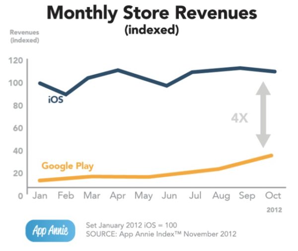
From App Annie you could see that iOS Store revenue is like 4 times more than Google Play on a monthly basis.
If you need to choose one platform then it all depends on your target audience and their smartphone choices. As marketer, we have to follow our users and fish where the fish are.
Lastly, the above is extracted from “Mobile Asset” chapters in my latest book about Vietnam Digital Marketing. To buy the ebook, please use this link.